Marique and Derek’s were married this past January at the Willowdale Estate in Topsfield, Massachusetts. Their
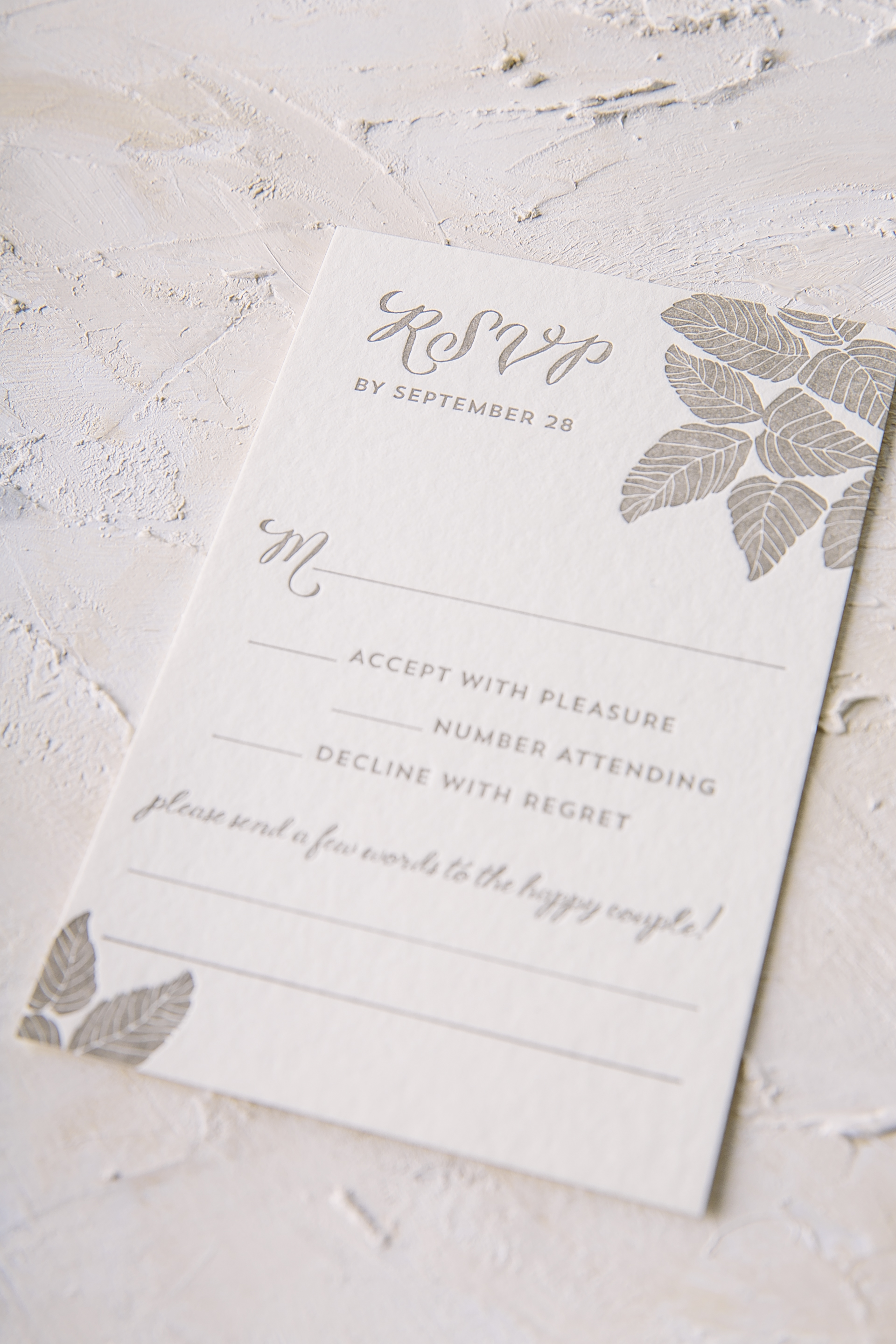
botanical foil stamped wedding invitations reflected the aesthetic of their venue beautifully. A plum letterpress border and a thin tawny matte border added a subtle touch of color yet still complimented the custom pattern scattered within the suite. This Haynes set included a coordinating reply card, rehearsal dinner card and accommodations card, all carrying botanical motifs throughout – including the envelope liner as to wrap everything up. This stunning suite wouldn’t have been possible without the help of our friends at Gus and Ruby!


Foil color: Tawny Matte | Letterpress color: Plum | Fonts: Plaza Script, Social and Carrington | Design: Haynes | Paper: 2 ply Bamboo, 1 ply Bamboo | Size: S-8 | Liner: Custom pattern in CMYK | Customization: 40388 | Gus and Ruby
Meresa and Eric got married this past December at the Omni Amelia Island Plantation. These polished foil stamped wedding invitations beautifully reflect their resort in Amelia Island, Florida. The invitation was printed in our Navy letterpress color and Gold Mate foil stamping accents on our gray paper, a color combination that creates an elegant overall aesthetic. The color palette was also carried onto the insert cards as well as onto the belly-band which featured a monogram in honor of Meresa and Eric. Throughout the suite, little botanical elements were added throughout the suite to add a romantic touch to this formal suite. The gold matte envelope liner tied everything together effortlessly with the help of Creative Touch.


Foil stamping color: Gold Matte | Letterpress ink color: Navy | Fonts: Gothic + Plaza | Design: Custom Library | Paper: 2 ply gray | Size: S-8 | Customization: 40463 | Creative Touch
We can’t imagine a better fit for a wedding in Cape Neddick, Maine than the design chosen for Allyson and Charles. These nautical foil stamped wedding invitations set the tone for their wedding at The Cliff House, a beautiful venue with breathtaking views of the sea from every angle. It’s only appropriate that the invitation was printed in Midnight letterpress as a nod towards the nautical affair, while accents of Rose Gold Shine gave the invitation an extra touch of elegance. The Plymouth die-cut shape added some extra interest to the design as well. A custom map pattern of the surrounding area was supplied for the lining of the envelope printed in Midnight to coordinate with the rest of the suite while little touches of seafaring motifs were included within the set in a tasteful way as well. The rehearsal dinner invitation was printed digitally in our Sangria ink color which added an unexpected but eye-catching twist to the invitation suite. We always look forward to working with Gus and Ruby on all their gorgeous invitation suites and this set was certainly no exception to that!


Letterpress ink color: Midnight| Foil stamping color: Rose Gold Shine | Digital ink color: Sangria | Fonts: Smock Ruby + Bell MT | Design: Custom Library | Paper: 2 ply bamboo, 1 ply bamboo | Size: S-8 | Customization: 39478 | Gus and Ruby
This past October Jori and Christopher were married at Architectural Artifacts in Chicago. Their venue is filled with a combination of formal yet vintage touches throughout and their refined letterpress wedding invitations reflected the space perfectly. Our Bristen design originally uses Sand letterpress only on the leaf motif, but this couple decided to change it up by throwing Taupe and Tawny Matte accents within the mix as well. To give the traditional invitation layout a little something extra, Tawny Matte was also added to the names of the bride and groom to make them shine among the rest. Guests will find the same leaf motif added throughout the rest of the set to keep everything cohesive and interesting to the eye. Thanks to the help of Quintessence Fine Papers and Gifts, we were able to create an incredibly sweet suite.


Letterpress ink colors: Sand + Taupe | Foil stamping color: Tawny Matte | Fonts: Smock Ruby + Woodland | Design: Bristen | Paper: 2 ply bamboo | Size: S-8 | Customization: 39441 | Quintessence Fine Papers and Gifts
We always love seeing what kind of Rainier customizations our clients will dream up next. These pretty purple and blue letterpress Bat Mitzvah invitations are a perfect example of a harmonious color combination. Pansy, Gossamer, and Azure all came together in different ways throughout this suite, yet still tied back to the original invitation color palette. The Rainier pattern was another consistent element used in different ways that created visual interest and gave each card a sense of individuality. To give the set an extra dose of playfulness, an envelope liner was added to tie all the colors and pattern together effortlessly.


Letterpress ink colors: Pansy from Bella Figura + Gossamer + Azure | Fonts: Jules + Scala | Design: Brynn | Paper: 2 ply white bamboo, 1 ply white bamboo | Size: S-8SQ | Liner: Rainier pattern in Gossamer + Azure + Pansy from Bella Figura | Customization: 38906 | LS Amster Company
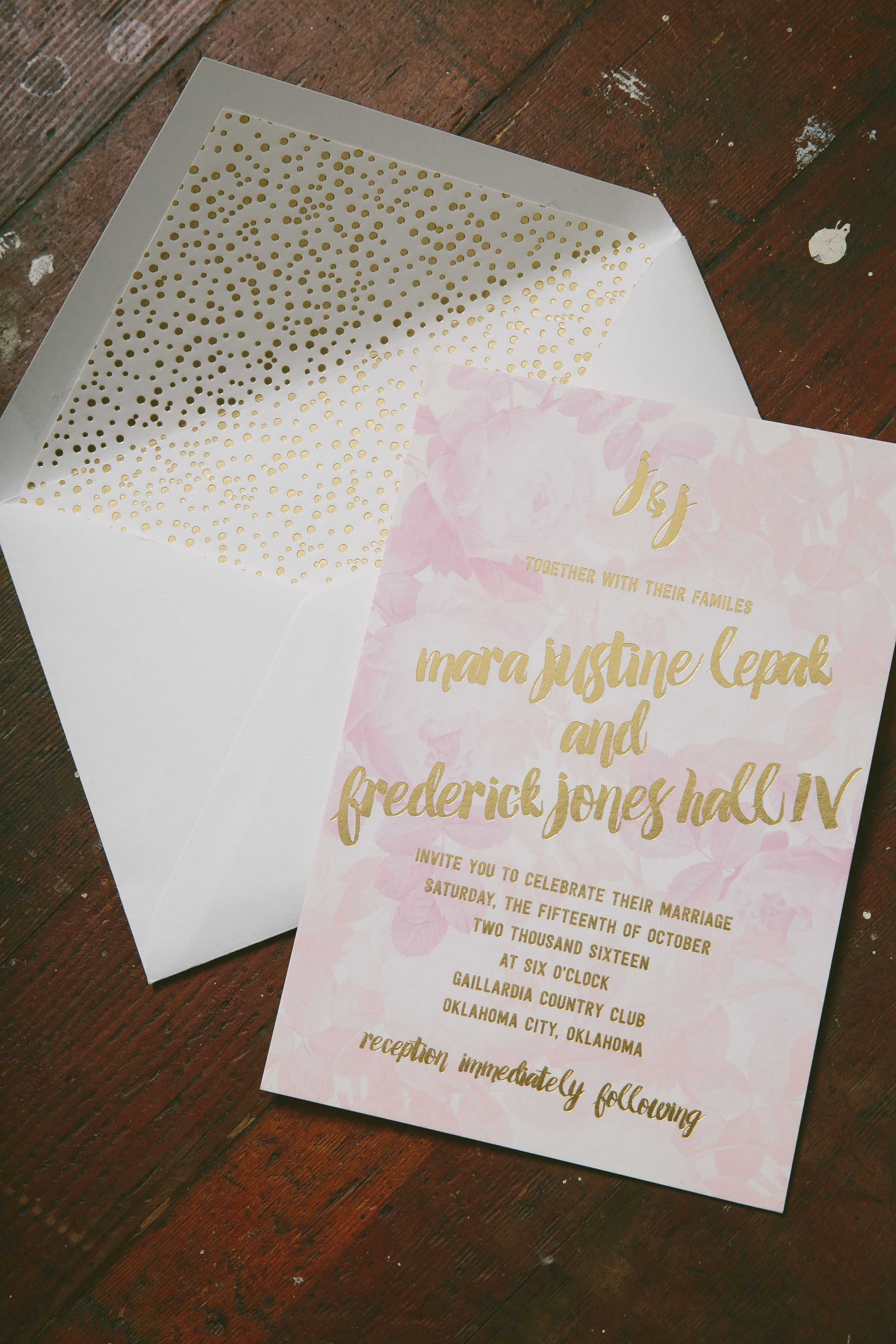
Justine and Jones took our Bloomsbury design and made it into something completely their own for their October affair. These playful watercolor wedding invitations were printed in our Gold Matte foil with dreamy florals added in a palette of pinks as the backdrop. To include a little bit of whimsy, foil stamped polka dots were incorporated throughout the suite. The rehearsal dinner set was kept safe and sound in a corresponding sleeve to give the set a little extra dose of individuality. Guests will be pleasantly surprised to find this same theme carried onto the welcome tags and thank you set as well. This spirited set wouldn’t have been possible without the help of No Regrets- OK and we have no doubt the wedding of Justine and Jones came together just as beautifully as their suite.


Foil stamping color: Gold Matte | Digital: CMYK | Fonts: Ada + Festus | Design: Bloomsbury | Paper: 2 ply white bamboo, 1 ply white bamboo | Size: S-8 | Liner: Pearl pattern in Gold Matte | Customization: 35227 | No Regrets – OK
We customized our Ellory design to fit Brianna and Patrick’s wedding at The Walton House in Homestead, Florida. Thanks to the help of our friends at Stationer on Sunrise, these botanical foil stamped wedding invitations reflected their venue perfectly with images of greenery incorporated that can be similarly found on the property of The Walton House. The suite contained corresponding reply, reception and website cards to complete the package, all with rounded corners for a softer overall aesthetic. On the flip side of these cards, guests will be pleasantly surprised to find more traces of greenery, tying everything together perfectly.


Foil stamping color: Copper Shine | Fonts: Lavish + Greenaway | Design: Ellory | paper: 2 ply ivory bamboo, 1 ply ivory bamboo | size: S-8 | liner: Olive Tree pattern | customization: 35195 | Stationer on Sunrise
Cara and Marshal customized our Barnesly design for their wedding at the Hotel Du Village in New Hope, Pennsylvania. These moody navy watercolor invitations with gold foil stamped accents were created thanks to the help of our friends at ORRganics. The suite contains a corresponding reply card and reply envelope printed in our crisp Navy letterpress. To keep everything safe and sound, they opted for our Juliette sleeve with a monogram accent and an E.E. Cummings quote was also added as the sweetest finishing touch.


Foil stamping color: Gold Matte | Letterpress ink color: Navy | Digital Color: Navy | Fonts: Jules + Covington | Design: Barnesly | paper: 2 ply white bamboo + 1 ply white bamboo | size: S-8 | customization: 37064 | ORRganics
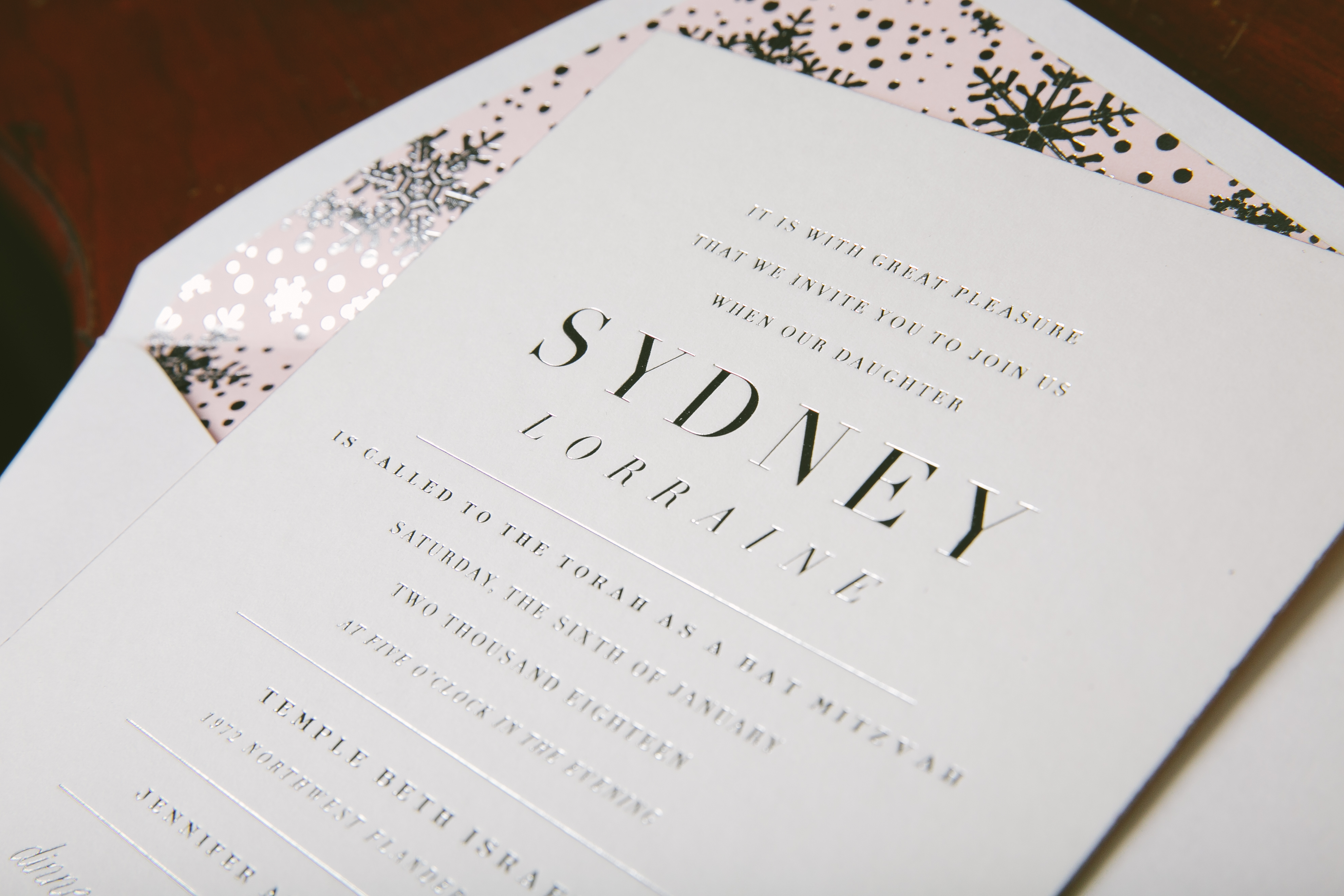
We worked with Uptowne Papers to create these silver foil stamped Bat Mitzvah invitations that are perfect for any wintry affair. They decided to add a little glimmer and shine to our Exeter design while keeping the reply card and reply envelope a bit more subtle with our Silver letterpress ink color. Little snowflakes were added as yet another wintry accent. To give the suite an extra special factor, we created a custom envelope liner pattern with Silver Shine snowflakes and a pearl background. The minute any guest opens their invitation, they will know right away that they are in for an elegant yet festive time!


Foil stamping color: Silver Shine | Digital Color: Pearl | Fonts: Copperlove + Capital + Didot | Design: Exeter | paper: 2 ply white bamboo + 1 ply white bamboo | size: S-8 | liner: Custom pattern in Silver Shine + Pearl | customization: 39231 | Uptowne Papers
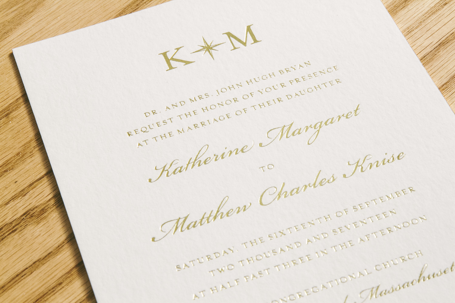
Take elegance, add a touch of nautical flair, and you’ll find Katherine and Matthew’s suite as the beautiful end result. You can never go wrong with classic gold foil stamped wedding invitations, but this couple decided to add their own twist by including a belly-band featuring an exquisite painting of Nantucket Island. The suite included other nods towards Nantucket like the motif of the island on the weekend celebration card and the nautical monogram on the invitation and thank you card. These kinds of accents made the suite harmonious in an incredibly tasteful way thanks to the help of Parchment Fine Papers. The watercolor envelope liner printed in Sea Mist was yet another subtle yet complimentary means of tying everything together.


foil stamping color: gold shine | digital ink color: CMYK | fonts: Cameron, Worthington | paper: 1 ply white bamboo, 2 ply white bamboo | size: S8 | envelope liner: Watercolor 6 in Sea Mist | customization: 38415 | Parchment Fine Papers


