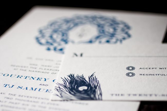
You’d never know this invitation was offset printed unless you felt it! Libby of Byrd & Bleecker definitely knows how to work within and around our albums, combining a converted version of the Lashar design that looks completely unique, with the peacock plume from our Everyday line.

Because the full order was offset in midnight and peacock inks, she was able to help the client save a bit of money and still get them an eye-catching design.

inks: midnight + peacock | fonts: engravers + gothic engravers | paper: 1-ply white | invite size: Tier 3 | liner: repeating lashar cartouche design in white + peacock | printing: offset
This design won an honorable mention in our Smock design competition for the first half of 2011. This twice-a-year competition recognizes outstanding and inspired designs submitted by our beloved dealers.
We are crazy in love with this great customization of our Lashar design, submitted by our friend Libby from Byrd + Bleecker in Fort Worth, Texas (who we had the joy of seeing last week when she came up for a visit – see the fabulous letterpress coasters made for her while she was here on Boxcar’s blog!). We can’t get enough of the creative ways she uses our designs and motifs to create unique invitations for the lucky couples that walk into her store!
ink: midnight + peacock | fonts: engravers + engravers gothic | paper: 1-ply white | printing: offset | invite size: s-8 |


by Sarah Walroth, In-House Designer.
These show-stopping letterpress bar mitzvah invitations were brought to us by LS Amster Co in Scarsdale, New York and we were happy to honor them in our most recent Smock Design Contest. The design was inspired by the boy’s love of swimming. The “scales” of our Odeon pattern on the reverse paired with our Phelps pattern for the envelope liner evokes the feeling of water and movement. The bold peacock blue ink is refreshing and is balanced by the earthy espresso. It’s a stunning combination that we just can’t get enough of and we’re proud to have worked with LS Amster on this lovely design.


Recently we were honored to have Brides ask us to create our vision of the perfect invitation for the upcoming royal wedding. With our Aberdeen letterpress invitations as our inspiration, we wanted to create something modern yet very sophisticated and regal. In shades of peacock and chartreuse paired with elegant script and a square shape, we love this look for a formal and stylish wedding celebration. We envision them enclosed in envelopes with a fabulous liner, gorgeous hand calligraphy and a patchwork of vintage stamps to complete the look. Check out all of the designs on the Brides magazine website and many thanks to our friends at Brides for asking us to contribute!

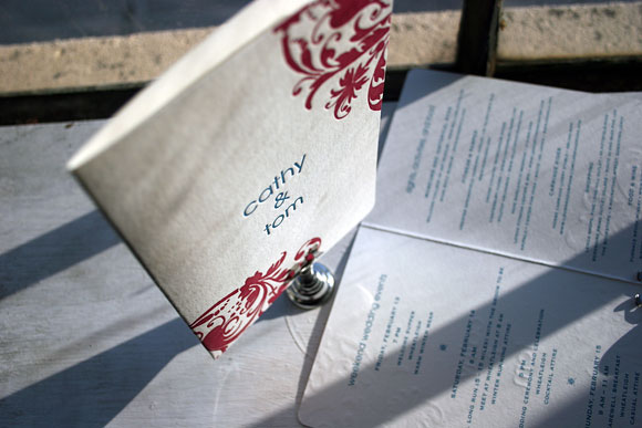
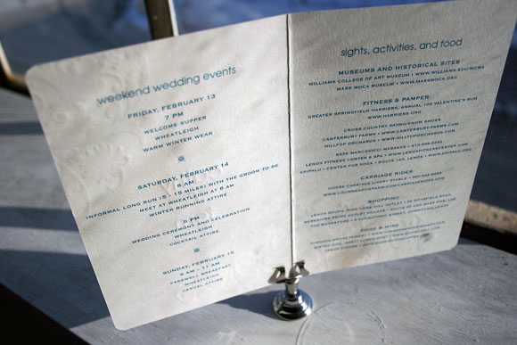
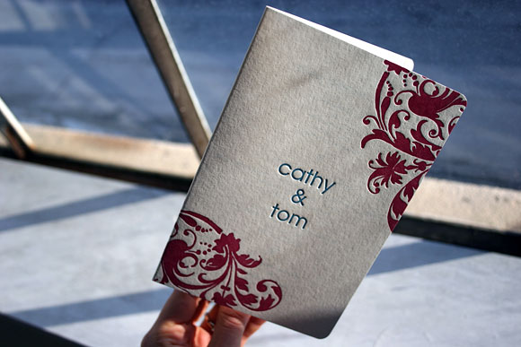
Having first printed beautiful letterpress wedding invitations for Cathy and Tom in our Cavall design, we were sincerely thrilled when No Regrets in Newton, Massachusetts contacted us again about printing letterpress event schedules for the couple’s guests. Using the same size booklet as our letterpress program covers, we created a completely custom piece where we letterpressed the exterior and offset printed all of the weekend event information on the inside so guests would know where to be, what to see and what to wear the weekend of Cathy and Tom’s celebration. The exterior is letterpress printed in raspberry and peacock inks while all of the details inside were flat offset printed in peacock. We also corner rounded the booklet to give it that perfect finishing touch, making it a truly special way for the couple to welcome their guests and invite them to join in on all of the weekend fun.


Thanks to team at No Regrets for the great opportunity to print something so special and fun!
