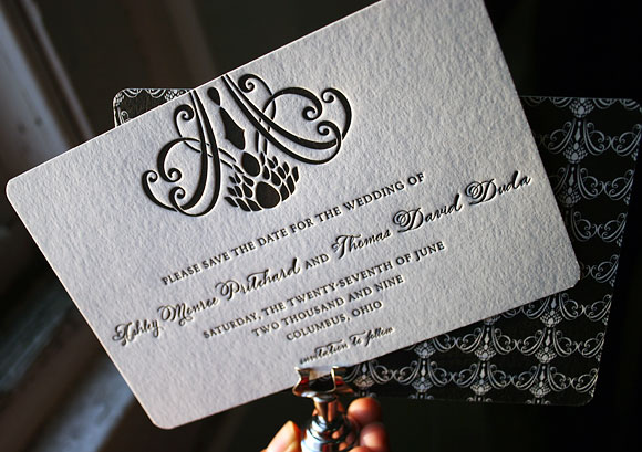
At Smock our goal is to ensure that our brides have one of kind invitations for their big day. With that in mind, we often accept custom artwork to pair with our wide variety of fonts and letterpress (or offset) print in our luscious ink on our luxurious bamboo paper. The artwork submitted to us by Peabody Papers in Grandview Heights, OH once compared with all of the above, blew us away!

The 3-color offset invitation was printed on both the front and the back in pewter, slate and gold inks. The juxtaposition of the flat yet colorful imagery with the black letterpress text created such a dignified look. The subtle hint of masculinity is impeccable. Well done Peabody Papers. Well done!
Meg, from Peabody Papers had the pleasure of working with the happy couple and says, “Working with Shawna has been so much fun! She wanted to convey a sense of elegance while evoking thoughts of champagne bubbles. I drew the “bubbles” and decided that I would use the block for their names vs. a more traditional treatment. The last piece to come together was the kalogram – 5 sheets of proofs! It payed off though as she loves it and is using it & the dot design throughout the reception at the Statehouse. I have a degree in printmaking and enthusiastically convinced her that Smock letterpress would be the most beautiful printing option!!! She really loves the invitations – thanks for everything!”
Excellent thinking Meg!!! Champagne kisses and Caviar Dreams to you!
inks: black + pewter + gold + slate | fonts: cameron + indigo | paper 2-ply white | invite size: S-8 | printing: letterpress + offset | edge painting: pewter | corner rounding
This design won third place in our Smock design competition for the first half of 2011. This twice-a-year competition recognizes outstanding and inspired designs submitted by our beloved dealers.
It’s a bit ironic that we have sun and summer on the brain today given the blinding snow currently falling over Central New York, but our dreams of sunshine can’t be deterred – we can’t wait for spring to get here! This time of year we start to get a lot of inquiries about invitation designs particularly well-suited to waterfront, beach or destination weddings so we thought we’d dig up some of our favorites from last year to share with you. There’s nothing like the promise of warm summer breezes to get you inspired, snow or no snow.


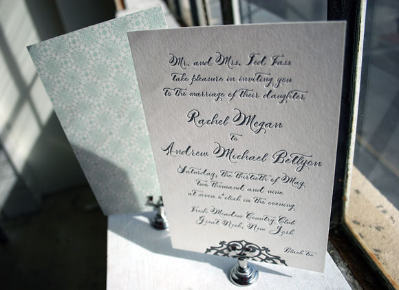
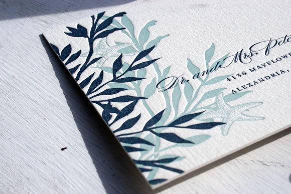
This first invitation is our Lashar design printed in pewter ink using our Smock Spencerian calligraphy font. The back of the letterpress invitation features gorgeous patterned backing printed in sea mist in our lesina pattern.

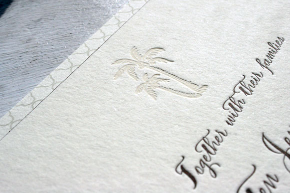
This invitation was a beautiful custom version of our Haddington design, printed in espresso ink and blind deboss. The palm tree motif was a custom addition to the design, making it perfect for an elegant destination wedding.

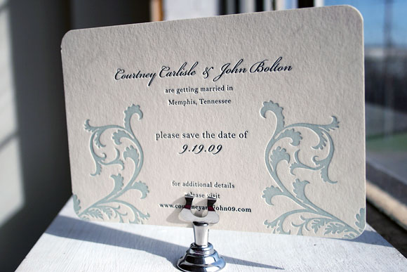
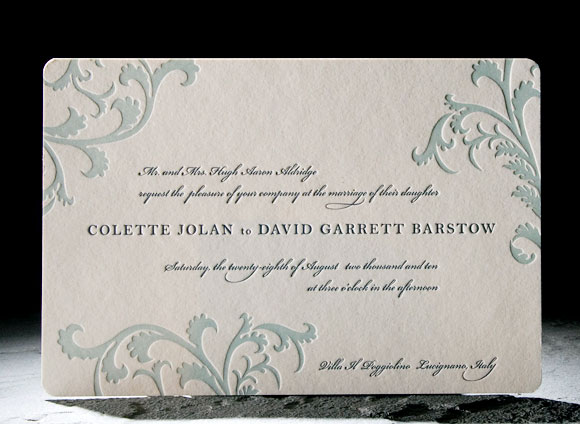
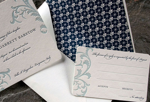
Brought to us by our friends at Peabody Papers in Columbus, Ohio, this version of our popular Vettore design was printed in midnight and seamist inks. The flourishes from the Vettore design were modified in such a way that they remind us of water and waves without being literal.


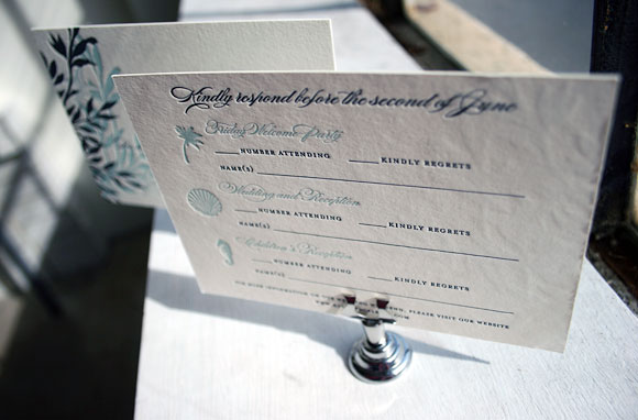
This custom version of our Engadine design was printed for the folks at Luxe Expressions in Atlanta. It’s a letterpress reply postcard printed in midnight and seamist that features pretty ocean-themed motifs. The card also includes space for guests to reply to multiple weekend events, which is a great option when designing your stationery for a destination wedding.
Vettore has long been one of our favorite letterpress wedding invitation designs and judging by its popularity, Smock customers agree! And as lovely as it is, it’s easy to see why so many people love Vettore!


The original Vettore design is printed in sea mist and midnight inks for a look that is romantic and a little bit vintage. The excitement of seeing how couples make the design their own never fades and we love some of the latest adaptations so much so that we just had to share them with you. How gorgeous are these?

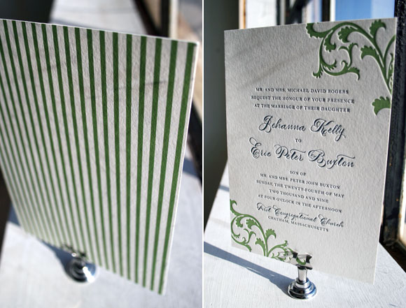
Vettore printed in clover and midnight with a vertical orientation and pattern backing in our seneca pattern, brought to us by the folks at Peabody Papers in Columbus, Ohio. We love how this puts a fresh and modern spin on the design, especially with the extra special touch that comes from using our Smock Spencerian calligraphy font.


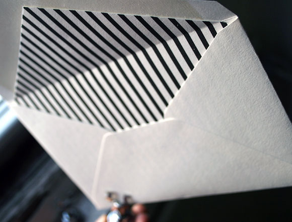
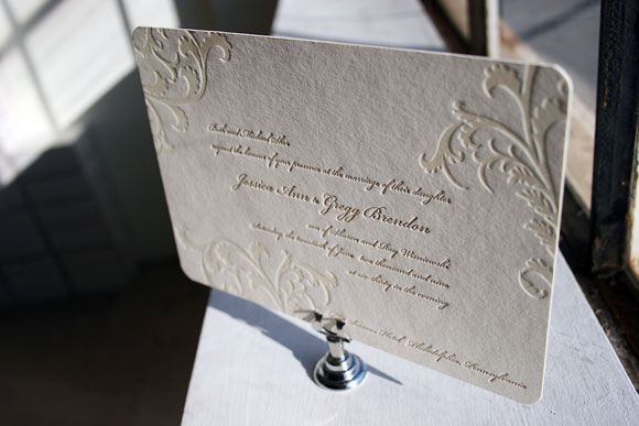
This incredible customization uses gold ink paired with blind deboss and it’s utterly sophisticated matched with the lined envelope in our clairveaux pattern printed in gold ink. A big thank you to Paper Chase in Margate, New Jersey for this classy take on Vettore!


We absolutely love edge painting and this lovely customization from Pearl Beach Paperie in Orlando, Florida is a perfect example of why. We love the eggplant and gold inks paired with the gold edge painting as it is so incredibly chic and luxurious.
Seeing what our awesome Smock stores dream up with their clients is thrilling for us and truly inspiring. We love seeing how creative and playful they can be with ink colors, embellishments and patterns and we can’t wait to share more great Smock customizations!
Nothing can beat this Nevis save the date design in a rich black letterpress ink, paired with cool patternings at play. It’s modern and elegant and just really, really cool. The Nevis has been one of our hot letterpress invitation designs for the season so far. Sent to us by our friends at Peabody Papers in Columbus, Ohio.
