The Spring/Summer 2017 issue of Present Magazine is available now! The latest issue is filled with fresh ideas for summertime gifting and entertaining, and includes our tropical Giverny wedding invitations. Many thanks to Present Magazine for the feature!


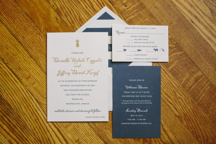
Danielle and Jeffrey worked with our friends at Lion in the Sun to create chic navy and gold pineapple wedding invitations for their Montego Bay celebration in May. We letterpress printed their invitations in navy ink, and highlighted their names with gold matte foil. Bold navy striped envelope liners reflected the seaside locale, while the gold pineapple motif gave a nod to the Round Hill Resort logo. We created a navy combination card that invited guests to both the welcome dinner and the farewell brunch, which resulted in a beautiful layered effect when the invitations were assembled and wrapped with their bellybands.


letterpress ink: navy | foil color: gold matte | fonts: Smock Ruby + Gill | paper: 1-ply + 2-ply white | sizes: S-8 + S-6 + S-5 | envelope liners: bar pattern in navy ink | belly band: digitally printed navy ink + gold matte foil | customization #:31082 | Lion in the Sun
It’s easy to get swept away in these beautiful and delicate letterpress save the dates. These beauties were submitted to us by our great friend, Nancy at Epitome Papers in Edina, Minnesota. We think you’ll agree that these save the dates are current and look absolutely fabulous printed in three ink colors. The oversized textured starfish is the perfect motif for a seaside wedding in Key Largo, Florida. These save the dates are whimsical in their own right – while still being playful and chic. The seahorse pattern envelope liner really makes a bold statement of what guests can expect as far as wedding atmosphere. We can just close our eyes and feel the warmth of the golden sunshine and the white sandy beaches!
inks: spring + slate + inkless blind deboss | font: smock harrison | paper: 2-ply white bamboo | printing: letterpress | edge painting in spring | back patterning: gala in spring |liner: the seahorse pattern in slate | invite size: S8SQ

Our rockin’ friends at Salutations sent us this fabulous beach-inspired letterpress invitation design a while back. We’re calling it an oldie but goodie, featuring pewter ink on our seamist bamboo paper. It’s tea length to fit our #10 envelopes, which were lined in our seneca stripe pattern in coordinating pewter ink. We love this design, featuring oceanic motifs from our Social Occasions album, for summer weddings and destination weddings and love how it brings an unexpected touch to a beach chic look.


At long last, we’re excited to share the winner of our Smock Design Contest, a custom letterpress and offset wedding invitation sent to us by our friends at Papery & Cakery in Boca Raton, Florida. This design features offset printing in a custom palm tree design on the front, printed in sand ink, combined with letterpress text printed in midnight ink. It’s a sophisticated combination of texture and color that is exemplified with the perfect finishing touches – corner rounding and edge painting in midnight. The envelope was lined in our payette pattern in midnight, perfectly coordinating with all of the other design elements for a look that is polished and simply beautiful.


Our special guest judge Nole Garey of Oh So Beautiful Paper selected this design as our contest winner, because she fell in love with the combination of letterpress and offset printing. She says, “I love everything about the design, from the color selections to the midnight blue edge painting to the calligraphy details. I love the way the soft palm trees almost look like delicate feathers against the ivory background.”
Thank you so much to Papery & Cakery for sending us this incredible design and to all of our design contest winners for continually inspiring us. Thanks are also due to Nole for helping us out with the difficult task of narrowing down all of the amazing designs to just a few winners. Thank you!
To learn more about Papery & Cakery, check out their recent Smock Store Spotlight.
It’s a bit ironic that we have sun and summer on the brain today given the blinding snow currently falling over Central New York, but our dreams of sunshine can’t be deterred – we can’t wait for spring to get here! This time of year we start to get a lot of inquiries about invitation designs particularly well-suited to waterfront, beach or destination weddings so we thought we’d dig up some of our favorites from last year to share with you. There’s nothing like the promise of warm summer breezes to get you inspired, snow or no snow.


This first invitation is our Lashar design printed in pewter ink using our Smock Spencerian calligraphy font. The back of the letterpress invitation features gorgeous patterned backing printed in sea mist in our lesina pattern.

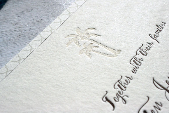
This invitation was a beautiful custom version of our Haddington design, printed in espresso ink and blind deboss. The palm tree motif was a custom addition to the design, making it perfect for an elegant destination wedding.

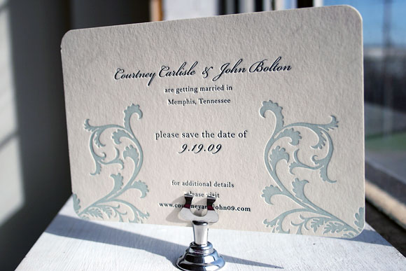
Brought to us by our friends at Peabody Papers in Columbus, Ohio, this version of our popular Vettore design was printed in midnight and seamist inks. The flourishes from the Vettore design were modified in such a way that they remind us of water and waves without being literal.


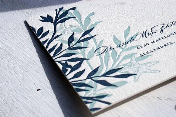
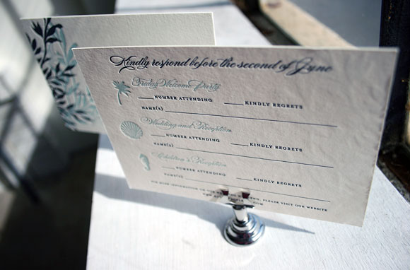
This custom version of our Engadine design was printed for the folks at Luxe Expressions in Atlanta. It’s a letterpress reply postcard printed in midnight and seamist that features pretty ocean-themed motifs. The card also includes space for guests to reply to multiple weekend events, which is a great option when designing your stationery for a destination wedding.


