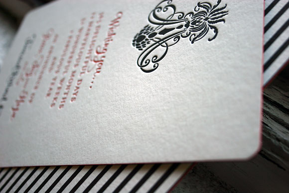
We’re still feeling the (letterpress) holiday spirit here at Smock…thanks in part to all the great custom holiday cards we’ve had on our presses lately. This was an elegant, cool & fun holiday design that we printed recently, based on our Nevis wedding invitation . What a creative customization….red and black letterpress inks, red edge painting (wow! it really stands out against the black), the seneca stripes pattern in black for a backing, and the sottern envelope liner in black. The mix of patterns & the accents of red create such a good energy. This custom holiday card came to us from Events in Houston.

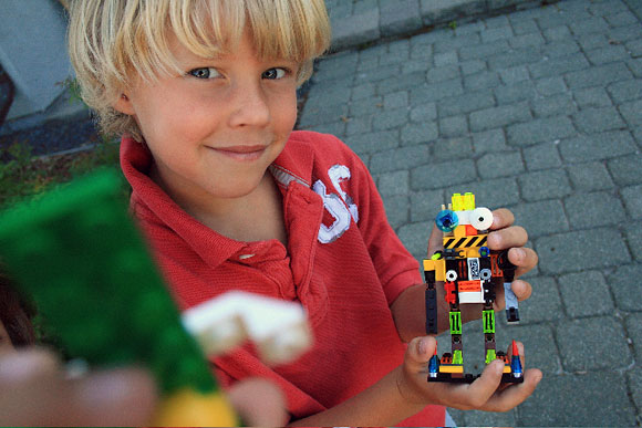
LEGOS. Because without them we would all have cabin fever. Seriously. My oldest plays legos for at least an hour every day. Sometimes more. Weekends can be lego building marathons with my three children and husband hunkered on the floor surrounded by mounds of colors and shapes. Even my middle and youngest build away. Putting green with blue and red with orange to create asymmetrical towers and imaginative aliens. What am I doing during all of this quiet activity, you ask? Loads of laundry, paying the bills or sweeping the floor. Or on a good day writing a blog entry.
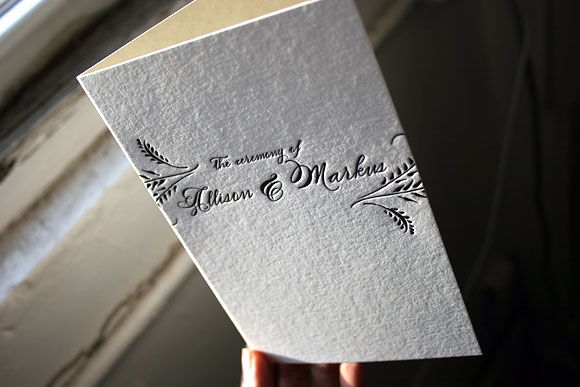
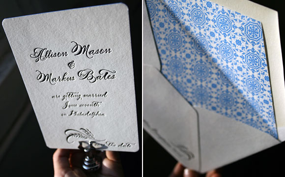
We are obsessed with hand edge painting (or edging) over here at Smock. Black letterpress ink, white bamboo paper, and pure blue edge painting — it’s what we dream about! We think edge painting is going to be a big trend for this upcoming wedding season — for good reason too. It’s such a elegant, classical, but cool way to add color to your letterpress wedding invitations. Also big for the upcoming wedding season: calligraphy (or calligraphy accurate fonts, like our only-available-at-Smock Spencerian font used here). Pictured below are additional letterpress pieces from our Haddington wedding invitation suite: save the dates, menus, and a letterpress wedding program cover, all printed in a rich black letterpress ink.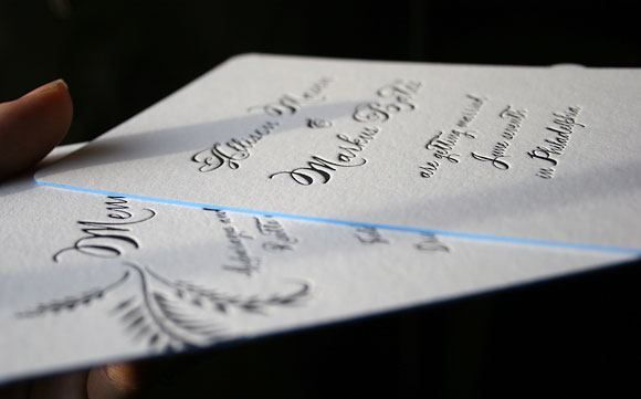
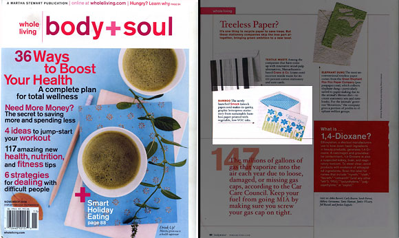
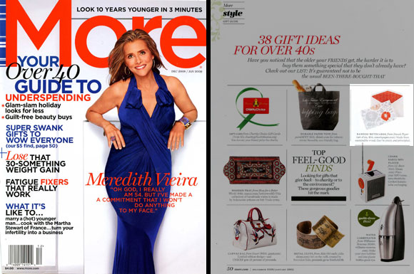
What a thrill to find Smock’s Garden letterpress thank you cards in this month’s issue of Body + Soul! I don’t read a whole of magazines, but Body + Soul is one of the few that I subscribe too (in part because I really want a Life Coach!) — I love their laid back, eco approach and recipes involving kale. Body + Soul writes, “The newly launched Smock makes its quirk graphic letterpress stationery from sustainable bamboo paper printed with vegetable, low-VOC inks.” We also were excited to have our Delft letterpress notecards in the December 2008 / January 2009 issue of More magazine (they call us “pretty and principled,”) and to see Smock as the tip of the day at Green Daily (they featured our holiday cards — hooray!).
We were thrilled to hear that our favorite stationery store in Dallas, Paper & Chocolate, was chosen for Style Me Pretty’s Little Black Book, one of the best wedding resources out there — congratulations! Paper + Chocolate was one of the first stores to pick up Smock’s wedding album when we launched this May — not to mention it’s the best idea for a store. The thought of really good chocolate + really beautiful stationery always gets our hearts racing. We were super excited to see our Rhon wedding invitation on Paper + Chocolate’s Little Black Book page….
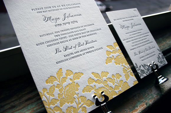
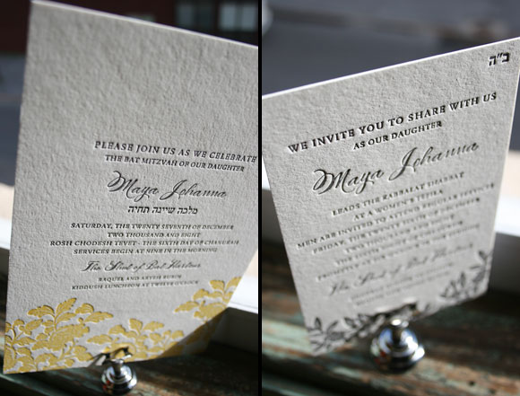
We love customizing our letterpress wedding invitations for other joyful events — and we loved how our Rhon design transformed into a perfect letterpress Bat Mitzvah invitation. True elegant sweetness. This was sent to us by Aileen Invitations in North Miami Beach.
Here are a few great ideas from Smock’s client coordinator Tiffany Field that will help keep your letterpress invitation costs down, while still giving you a really wonderful letterpress wedding invitations.
Take a 2 or 3 color design down to 1 color
Many of our 2 and 3 color designs look equally impressive when printed in one color. Fewer colors mean fewer runs through the press which equals less expense. Our designer BethAnn is amazing at this – she knows just what to add and take away so that your design looks just as inviting as its more colorful counterpart.
Splurge on a 2 or 3 color design for the invitation and opt for 1 color accessory pieces
If you absolutely cannot live without a multi-color invitation, opt for your other pieces (reply card, directions card, reception card, etc) to be printed in 1 color. You will get the same impact with your invitation while saving considerably on your additional pieces.
Downsize and use a smaller size card (i.e. a reply card size for save the date)
Some budget savvy friends of ours came up with this idea for their clients’ save the dates and birth announcements, and the idea has really taken off. This is one of my absolute favorite cost cutting options – they are such a sweet little size!
Eliminate the reply card all together and put the contact information on the invitations
This idea is becoming more popular with brides who are not just minding their budget but the environment as well. Printing your reply information in the bottom left hand corner of your invitation is an acceptable alternative that can save you money.
Use a “website card” (usually the size of a place card or reply card) instead of a direction and accommodations card
Website cards direct guests to a site that will feature information related to your event – directions, accommodations, weekend activities, etc. This is a great idea, especially for the brides who have a wealth of information on their websites. From a guest’s point of view, I think they would appreciate that one card can direct them to so much information; I know that trying to keep track of so many invitation inserts can be challenging to many people. This allows them to access information about the wedding at their convenience.
Choose a reply postcard instead of a reply card and envelope
Reply postcards are less $, less postage, less bulk (but also less formal).
Pictured below: #1. Our 2 color Chasseral wedding invitation (on right), letterpressed in one color (on left) // #2. The Cavall letterpress reply card postcard (double-sided) // #3. Sweet, small save the dates (these cards are the same size as a reply card). Engadine design on left; Lashar design on right. // #4. Rhon two color wedding invitation (on left), with 1 color reply card and 1 color direction card (on right)


