Preppy Pink Pony sent us these wonderful custom Costa Rican inspired wedding invitations. The set is highlighted by an offset map of the country itself on the folio. A perfect first impression for a wedding that was obviously a great time!
inks: pool + blind deboss | fonts: clementine + graham | paper: 2-ply ivory + 1-ply ivory | printing: letterpress + offset | invite size: S7 folio | folio: offset in pool | customization #: 16312

We love hearing a touching love story – the way that a couple meets, falls in love, and seeing these details woven into their wedding day. We were thrilled to find out the story behind the couple that ordered these three color letterpress wedding invitations. Peak Xperience was kind enough to share with us their engagement session, love story, and photos from their gorgeous wedding.

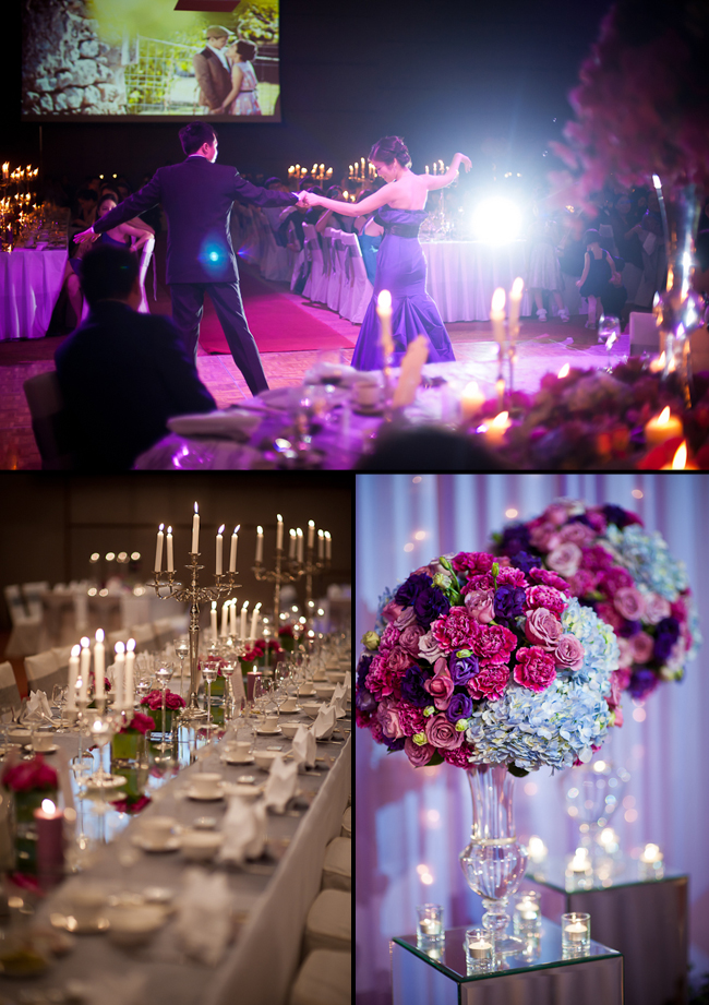
The Garden of Eden inspired the wedding ceremony: lush florals in purples and greens combined with a mix of modern and vintage details set the scene for this jaw-dropping celebration.

Peak Xperience explains, “The reception was kept modern and sophisticated in shades of dark purple, blue and silver. All of the details of their wedding are inspired by their love story, so for the dinner, it was almost like a ‘twilight’ theme (not Twilight the vampire movie!) but twilight as in between sunset & dusk, when the first glimmer of stars begin to appear, the ambiance is romantic and nostalgic.”
We were blown away by the size and beauty of their impressive wedding cake, which towered over the couple! Each tier is incredibly stunning.

Vendors: Caterer: Nathalie’s Gourmet Studio | Wedding Cake: PassioNate Cakes by Man Kwan | Cake Pops, Mini Cake & Tarts: TrulyScrumptious! | Wedding Gown: Divine Couture | Flowers: Flower Series | Wedding Ceremony: Cheras Baptist Church | Invitations: Smock via Peak Xperience
Though the invitation is pretty in its own right, with its die cut shape and metallic edging, the real star of this set is the folio interior. Annie from Hitched worked with our graphic design team to create this unique and elaborate map of the Washington D.C. metro. Offset maps are becoming more and more popular for envelope liners and folio interiors.
ink: taupe | fonts: submitted artwork | paper: 1-ply white | printing: letterpress | edge painting in metallic gold | invite size: S7 Chesapeake die cut | folio: custom map in offset taupe | customization #: 16294 |

We were excited to print this custom artwork submitted by RSVP Today. The whimsical floral pattern paired with our Plymouth die really enhances the overall look of the invitation. The additional pieces are charming and perfectly correspond with the invite in the sweetest color palette.
inks: sea mist + silver | paper: 2-ply white | printing: letterpress | custom supplied art | invite size: S8 Plymouth Die | customization #: 16105 |

This nautically themed letterpress wedding invitation suite was brought to us by our friends at Gus & Ruby Letterpress. The use of the anchor and rope motifs throughout the suite do wonders in keeping a consistent theme throughout.
inks: midnight + gold | fonts: mina + inigo | paper: 1-ply ivory | printing: letterpress + offset | invite size: S7 for folio | folio: offset in gold + midnight | customization #: 16047

Trisha Logan, a paper and textile obsessed designer, and owner of Shindig Paperie in Fayetteville, Arkansas is joining us today with a spectacular spotlight on her charming storefront. We love the way she incorporates Smock products throughout the shop — the pops of bright colors contrast beautifully next to crisp, clean whites. 
Behind the scenes of Shindig Paperie. My background is in textile and apparel design, but I’ve worked as the art director and designer for a large gift and paper line for 9 years. I saw so much beautiful product at trade shows and in my trend research. In addition, I’m very attached and connected to my quaint college town, Fayetteville. Eventually, over many late night conversations with my good friend Brooke, a former shop owner and sales rep, we decided to open a shop to bring some of these fabulous lines to our eclectic little downtown district. No similar concepts for a store existed in the area, and many local brides were frustrated by the lack of great paper here. Most chose to go online for unique invitations despite the surging trend and movement toward “buying local”. We had been in love with Smock for a long time and knew it would be the first line we wanted to get for the shop.
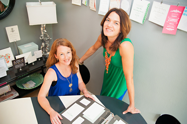
Stationery Love. My favorite part has to be discovering new lines, bringing them to town, then seeing people go crazy for them at the store, on Instagram, and on Facebook. I also love helping people add unique, personal touches to their weddings and special occasions. I’ve always gone a little nuts with my own parties and this way I get to do it more often! The most challenging part is definitely trying to juggle the different roles of being a small business owner, art director for another company, mother, and wife. It gets a little crazy. Thankfully I have a great business partner in Brooke and an understanding, supportive family.
 Supporting local + green businesses. We make an effort to carry as many green lines as possible; I would say they make up about 70% of the store. We also try to carry as many local and regional lines and artists as possible. In addition, we donate pretty regularly to various fundraising efforts in our area, through both design work and product. We’re also in the process of starting a monthly group focused on writing letters and cards to area residents going through rough times.
  Must-see stops in Fayetteville, Arkansas. I love my town, and one reason is the locally-owned retail renaissance of recent years. We have a great relationship with a lot of stores in our downtown neighborhood, and they truly are some of favorite places to shop: the Mustache, Savoir-Faire, Mae’s Heirloom’s, Riffraff and Good Things, just to name a few.
 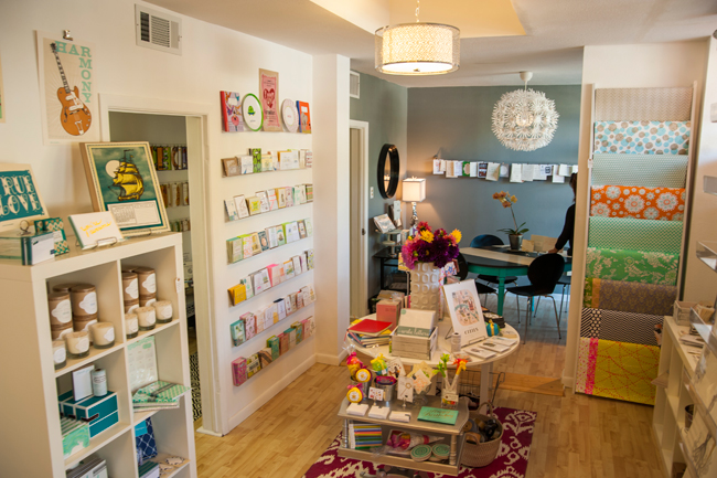 If you happen to live near (or visit!) Fayetteville, be sure you stop in and explore Shindig Paperie. Thanks so much Trisha (and Brooke!) for letting us get a peek inside your beautiful shop!
Another beautiful set from Pretty as a Picture! Ailbhe sends us more custom artwork and finds ways to make each piece of this set individually unique. Somehow this set looks like more than just two colors. Perhaps it’s the clever use of negative space on the inside of the folio, bringing ivory butterflies through the offset pearl ink. This was a very popular set and serves as a great example of how much you can achieve through the right colors and layout.
inks: pearl + pewter | fonts: meaculpa rob + shaw | paper: 1-ply ivory | printing: letterpress + offset | submitted artwork | invite size: S7 | folio: letterpress + offset in taupe + pearl | customization #: 11535 |

Gold and Espresso are one of the most elegant pairings of inks in our library. The submitted artwork sent to us by Paperkiss for this order was not only beautiful, but looked even better in print.
ink: gold + espresso | fonts: submitted artwork | paper: 2-ply white | printing: letterpress | submitted artwork | invite size: S8 | customization #: 16107 |

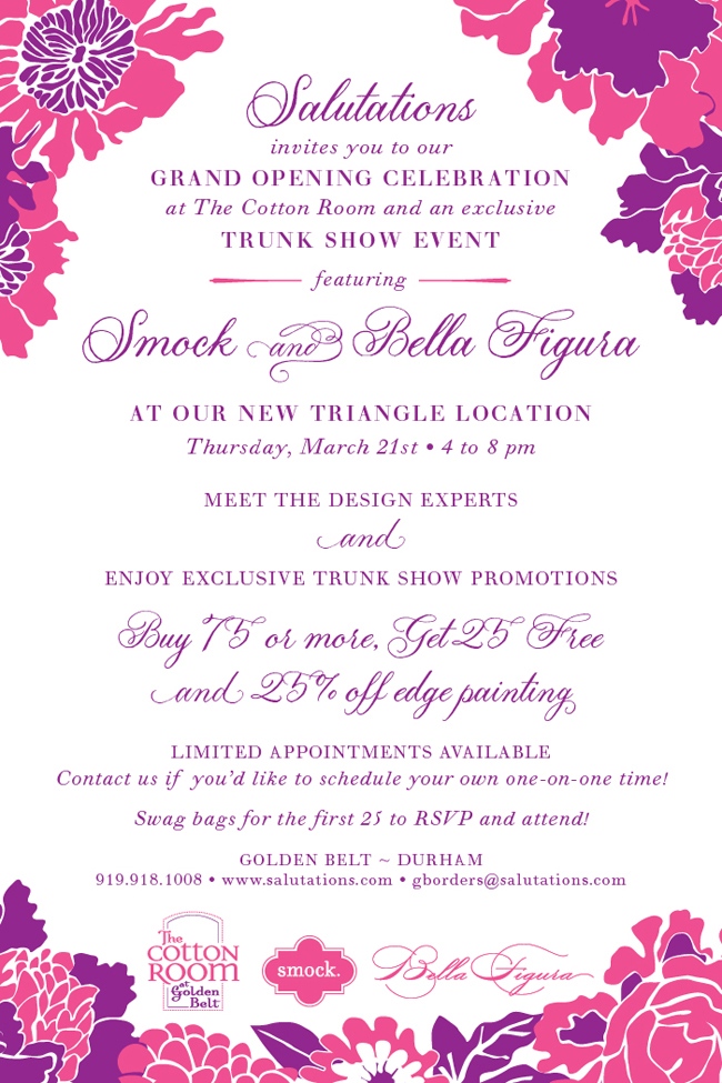
We’re heading South! Join us at Salutations for our next trunk show event — we’ll be in Durham on Thursday, March 21st for their grand opening celebration, and we’ll also be in Charlotte the night before for a trunk show! Take advantage of show specials and meet with a few of our design experts to create the invitations of your dreams. Visit Salutations for more information and to RSVP!

Courtesy of Frances at Paper & Chocolate, this set focuses less on elaborate inks, but rather on showcasing the right design elements and embellishments. Opting for a single color sometimes frees up the budget to include the extra embellishment options like edge painting and envelope liners. Add to that some submitted artwork for a custom hang tag and you end up with a lovely invitation set.
ink: black | fonts: submitted artwork | paper: 2-ply white | printing: letterpress | edge painting in taupe | custom hang tag | liner: metallic camel | invite size: S7 | customization #: 15711 |


 Supporting local + green businesses. We make an effort to carry as many green lines as possible; I would say they make up about 70% of the store. We also try to carry as many local and regional lines and artists as possible. In addition, we donate pretty regularly to various fundraising efforts in our area, through both design work and product. We’re also in the process of starting a monthly group focused on writing letters and cards to area residents going through rough times.
  Must-see stops in Fayetteville, Arkansas. I love my town, and one reason is the locally-owned retail renaissance of recent years. We have a great relationship with a lot of stores in our downtown neighborhood, and they truly are some of favorite places to shop: the Mustache, Savoir-Faire, Mae’s Heirloom’s, Riffraff and Good Things, just to name a few.
  If you happen to live near (or visit!) Fayetteville, be sure you stop in and explore Shindig Paperie. Thanks so much Trisha (and Brooke!) for letting us get a peek inside your beautiful shop!

