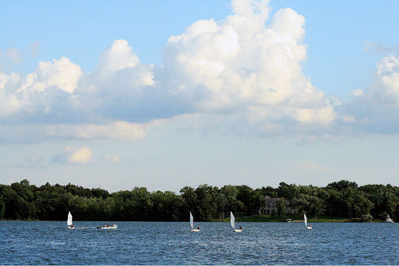
INDIAN SUMMERS. For one, they remind me of our true summers — which are, where we live in Wisconsin, filled with water and sand and popsicles. Oh, and a good amount of sailing. By the time the last regatta roles around we are ready for the quieter days of fall and the quietest days of winter. But we love those days of sunshine and boat rides while they last and miss them when they’re gone.


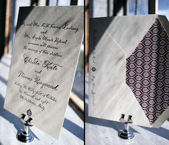
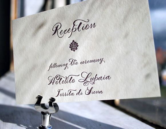
Ah, we love this — calligraphy letterpress wedding invitations printed in a really rich, deep eggplant ink. This is a customization of our Haddington wedding invitation design, featuring our Smock Spencerian calligraphy font (we had this font made just for us — it’s based on our favorite calligrapher’s penmanship). The envelope liner uses the Rousseau pattern in eggplant. Sent to us by Therese St. Clair in Greenwich, Connecticut.


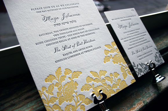
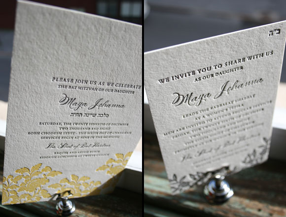
We love customizing our letterpress wedding invitations for other joyful events — and we loved how our Rhon design transformed into a perfect letterpress Bat Mitzvah invitation. True elegant sweetness. This was sent to us by Aileen Invitations in North Miami Beach.
THE MADISON CAPITAL BUILDING. i love its grandeur and loftiness. i love its weight and delicacy. i love its testament to 19th century craftsmanship. i love that it is surrounded by incredible locally grown produce every saturday in spring, summer & fall. and i love how it silences my kids (and silenced me as a child).


We loved the pairing of this airy envelope liner (the Jusan pattern in lake) + eggplant ink/a blind deboss on the Lashar invitation. Just a lovely letterpress invitation all around….sent to us by the Stationery Station in Highland Park, Illinois.
My Studio. After a many wonderful, albeit ‘unboundaried’, years of working from home I moved into a lovely space in a neighboring town. Here is a peek. Furniture still needs to be found and things still need to be finessed but I love the quiet and the fact that ‘everything has its place until /I /move it’ and the clarity of “mommy’s at work.” Consequently, I better appreciate the (many many) squeals and questions and “hold-me’s” I receive when I return home.


Black was the original letterpress ink hundreds of years ago, and we can see why….it’s hard to beat such a crisp, classic, perfect look. We’re seeing a lot of black ink this year and we love it. This is the Cavall letterpress wedding invitation design in black, sent to us by RSVP Today in New York City.
Smock note: we’re excited that our designer Amy Graham Stigler will be sharing her inspiration every Friday here on this blog. Amy has been an inspiration to us every day for many years now, so we’re glad you’ll get a chance to know her better too. xo, Smock
I’m not sure if its good precedent to start my first entry with a cheat. But I will nonetheless. This week it’s the three things i love: my beautiful, inquisitive & (at this very moment) screeching children. Each one a source of endless inspiration and constant diversion. So gone are the days of uninterrupted contemplation and perfectionist tweaking. Good bye. (Good riddance). Now my days are filled with pancake breakfasts, bedtime stories and kissed knees.


Check out the fall/winter 2008 issue of Brides New York magazine to see our Aberdeen letterpress invitation. Brides New York writes, “The stylish invitations from this Syracuse-based letterpress studio are printed on paper made from pesticide-free bamboo fibers. (Smock is the first company in the U.S. to do this.) The 12-suite wedding collection, designed by Amy Graham Stigler (formerly of Snow & Graham), features a range of playful yet elegant styles–from floral motifs to bold flourishes and patterns–that work for both casual and formal affairs. Every design can be personalized with different ink colors, fonts, and patterned envelope liners….”

We recently printed our Rhon design in our grass ink + pewter and we love it. See the original Rhon in Verbena yellow. Ever since we launched Smock at the Stationery Show in May, this design has been everyone’s darling.
