One of the things we most love about our Smock letterpress wedding invitations is the complete versatility in design. By selecting the patterns, envelope linings and ink colors of choice, a bride or groom can dream up a totally new version of a Smock design that is unique to their personality and their event. Lately, we’ve been seeing a lot of gorgeous adaptations of the lovely Vettore design and wanted to share one that we find particularly fun. The original Vettore design is printed in midnight and sea mist ink for a pretty, classic look.
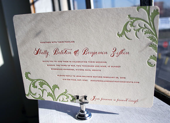
In this Vettore customization, the couple chose mango and clover inks for a look that is much more modern and bold. By using calligraphy accents the design remains a bit traditional and yet completely updated.
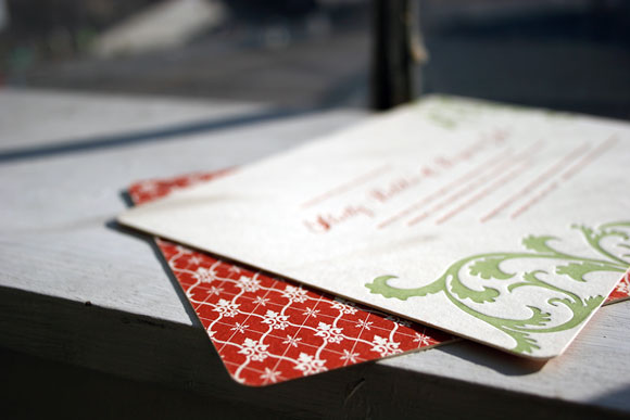
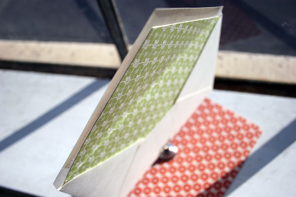
The bold mango patterned backing in our Willoughby pattern is an exciting and unexpected touch when guests open the envelope, which is beautifully lined in clover Willoughby.
We adore this version of Vettore, customized by RSVP Studio in Toronto and their client, for its fun and festive nature. It’s somehow strikingly bold and quietly tradtional all at the same time and we couldn’t love it more.
We’re all for color this season, but we absolutely fell in love with this letterpress wedding invitation design that celebrates all that is good and beautiful about neutrals. This invitation is based on our Haddington design — the invitation is letterpressed in espresso ink with an elegant blind deboss palm tree at the top. All of our pocket folios are custom, so we can add whatever patterns & ink colors you’d like to the folio exterior and interior. With this invitation, we left the the folio exterior unprinted, which means the focus is all about the warmth of the bamboo paper. The interior of the folio features the champlain pattern in a gentle sand ink. Pair that with a lined envelope that mirrors the interior of the folio (champlain pattern, sand ink) — and you have an invitation that is pure sophisticated pleasure and harmony. Sent to us by our ever creative friends at JAM/Mindy Weiss in Los Angeles.

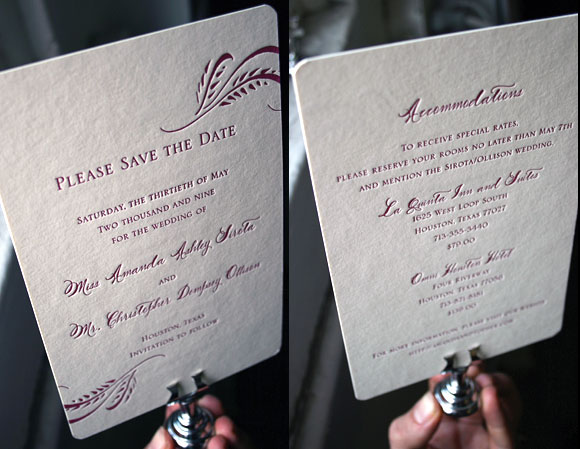
This is the Haddington letterpress save the date printed in a vibrant raspberry ink. We often print the Haddington design in dark inks — blacks, grays — but wow, it’s so pretty and cool in raspberry. We also love the mixture of fonts (the serif Inigo font + our Smock Spencerian font). And we love that it’s a double-sided save the date too, with accommodation information on the reverse side of the card. We can easily make any of our letterpress pieces double-sided — a nice option which saves paper and saves money too, when compared with the price of two separate cards. This save the date was sent to us by our friends at Events in Houston.
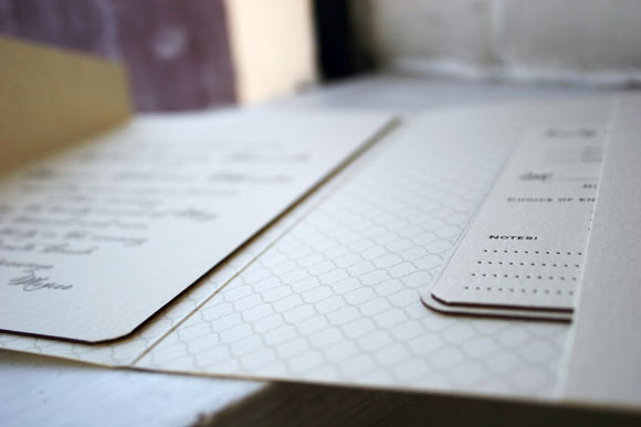
This was a great idea we hadn’t seen before — custom letterpress stationery in the size of a reply card. It seems the PERFECT size to us — sweetly intimate, and just enough room to write a nice personal note (but not too much room!). An extra bonus: it uses less paper than larger social stationery cards (eco!), which also makes it less expensive (nice!). This letterpress stationery is in our Haddington invitation design, using our Smock Spencercian fonts (based on our favorite calligrapher’s penmanship). And the gold edge painting! Oh, gold edge painting makes us swoon — we would like to edge everything we could in gold right now. It adds such an elegant finish to a card. Sent to us by our friends The Write Image in Rockville, Maryland.
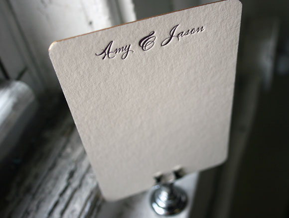
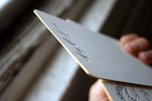
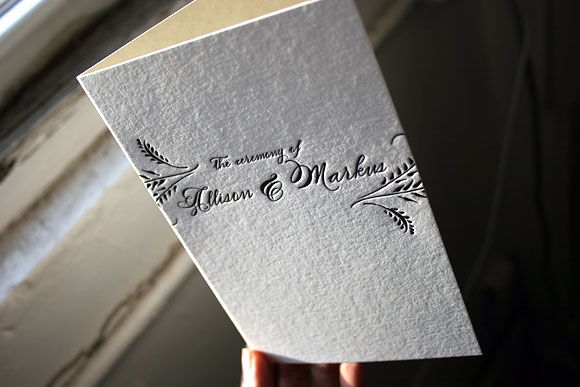
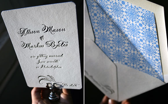
We are obsessed with hand edge painting (or edging) over here at Smock. Black letterpress ink, white bamboo paper, and pure blue edge painting — it’s what we dream about! We think edge painting is going to be a big trend for this upcoming wedding season — for good reason too. It’s such a elegant, classical, but cool way to add color to your letterpress wedding invitations. Also big for the upcoming wedding season: calligraphy (or calligraphy accurate fonts, like our only-available-at-Smock Spencerian font used here). Pictured below are additional letterpress pieces from our Haddington wedding invitation suite: save the dates, menus, and a letterpress wedding program cover, all printed in a rich black letterpress ink.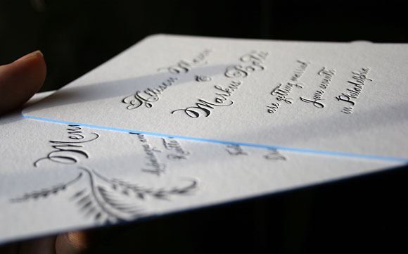
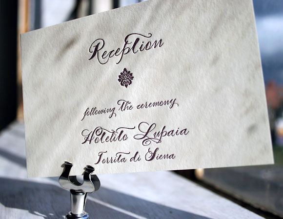
Ah, we love this — calligraphy letterpress wedding invitations printed in a really rich, deep eggplant ink. This is a customization of our Haddington wedding invitation design, featuring our Smock Spencerian calligraphy font (we had this font made just for us — it’s based on our favorite calligrapher’s penmanship). The envelope liner uses the Rousseau pattern in eggplant. Sent to us by Therese St. Clair in Greenwich, Connecticut.
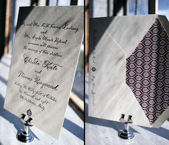

We loved the pairing of this airy envelope liner (the Jusan pattern in lake) + eggplant ink/a blind deboss on the Lashar invitation. Just a lovely letterpress invitation all around….sent to us by the Stationery Station in Highland Park, Illinois.

These first birthday party invitations were dreamed up by one of our client coordinators here (mom is Andrea, son is Maddox). Andrea used our favorite calligrapher (Debi Zeinert from the Blooming Quill) to write out the invitation in Debi’s “Whimsy” style, using a matching green ink. The envelopes were addressed with matching calligraphy too. So cute and sophisticated and cute!