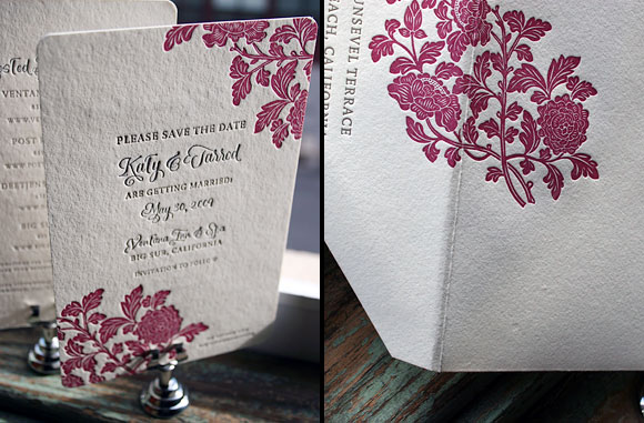
We love these colors for a letterpress save the date! The Rhon design in pewter and raspberry, plus our Smock calligraphy Clermont font. The two color letterpress envelope is really, really, really special too. And why shouldn’t the envelope be a keepsake? Sent to us by Francis Orr in Corona Del Mar, California.
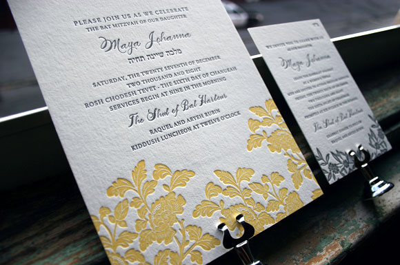
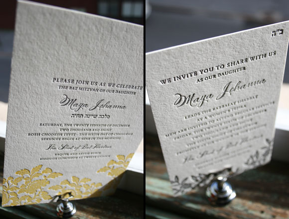
We love customizing our letterpress wedding invitations for other joyful events — and we loved how our Rhon design transformed into a perfect letterpress Bat Mitzvah invitation. True elegant sweetness. This was sent to us by Aileen Invitations in North Miami Beach.

We loved the pairing of this airy envelope liner (the Jusan pattern in lake) + eggplant ink/a blind deboss on the Lashar invitation. Just a lovely letterpress invitation all around….sent to us by the Stationery Station in Highland Park, Illinois.

Black was the original letterpress ink hundreds of years ago, and we can see why….it’s hard to beat such a crisp, classic, perfect look. We’re seeing a lot of black ink this year and we love it. This is the Cavall letterpress wedding invitation design in black, sent to us by RSVP Today in New York City.

Wow. This stationery just made our jaws drop when it came through our print shop. The combination of envelope lining (willoughby pattern in midnight) + backing (seneca pattern in pool) + the name letterpressed in midnight ink + rounded corners + ivory bamboo paper is so perfect! This design was sent to us by our friends at Salutations in Chapel Hill, North Carolina.
Here are a few great ideas from Smock’s client coordinator Tiffany Field that will help keep your letterpress invitation costs down, while still giving you a really wonderful letterpress wedding invitations.
Take a 2 or 3 color design down to 1 color
Many of our 2 and 3 color designs look equally impressive when printed in one color. Fewer colors mean fewer runs through the press which equals less expense. Our designer BethAnn is amazing at this – she knows just what to add and take away so that your design looks just as inviting as its more colorful counterpart.
Splurge on a 2 or 3 color design for the invitation and opt for 1 color accessory pieces
If you absolutely cannot live without a multi-color invitation, opt for your other pieces (reply card, directions card, reception card, etc) to be printed in 1 color. You will get the same impact with your invitation while saving considerably on your additional pieces.
Downsize and use a smaller size card (i.e. a reply card size for save the date)
Some budget savvy friends of ours came up with this idea for their clients’ save the dates and birth announcements, and the idea has really taken off. This is one of my absolute favorite cost cutting options – they are such a sweet little size!
Eliminate the reply card all together and put the contact information on the invitations
This idea is becoming more popular with brides who are not just minding their budget but the environment as well. Printing your reply information in the bottom left hand corner of your invitation is an acceptable alternative that can save you money.
Use a “website card” (usually the size of a place card or reply card) instead of a direction and accommodations card
Website cards direct guests to a site that will feature information related to your event – directions, accommodations, weekend activities, etc. This is a great idea, especially for the brides who have a wealth of information on their websites. From a guest’s point of view, I think they would appreciate that one card can direct them to so much information; I know that trying to keep track of so many invitation inserts can be challenging to many people. This allows them to access information about the wedding at their convenience.
Choose a reply postcard instead of a reply card and envelope
Reply postcards are less $, less postage, less bulk (but also less formal).
Pictured below: #1. Our 2 color Chasseral wedding invitation (on right), letterpressed in one color (on left) // #2. The Cavall letterpress reply card postcard (double-sided) // #3. Sweet, small save the dates (these cards are the same size as a reply card). Engadine design on left; Lashar design on right. // #4. Rhon two color wedding invitation (on left), with 1 color reply card and 1 color direction card (on right)


Green seems to be one of the colors of the season! This is an inspired customization of our Aberdeen save the date — perfect in espresso and clover inks. The font is our exclusive Smock Spencerian — a font based on our favorite calligrapher’s penmanship. This save the date was sent to us by our friends at Black Ink.

So it turns out our letterpress wedding invitation designs can make perfect baby announcements too. This is a too sweet customization of Sutton — dreamed up by Paces Paper in Atlanta, Georgia. We are in love!

These first birthday party invitations were dreamed up by one of our client coordinators here (mom is Andrea, son is Maddox). Andrea used our favorite calligrapher (Debi Zeinert from the Blooming Quill) to write out the invitation in Debi’s “Whimsy” style, using a matching green ink. The envelopes were addressed with matching calligraphy too. So cute and sophisticated and cute!

We recently printed our Rhon design in our grass ink + pewter and we love it. See the original Rhon in Verbena yellow. Ever since we launched Smock at the Stationery Show in May, this design has been everyone’s darling.