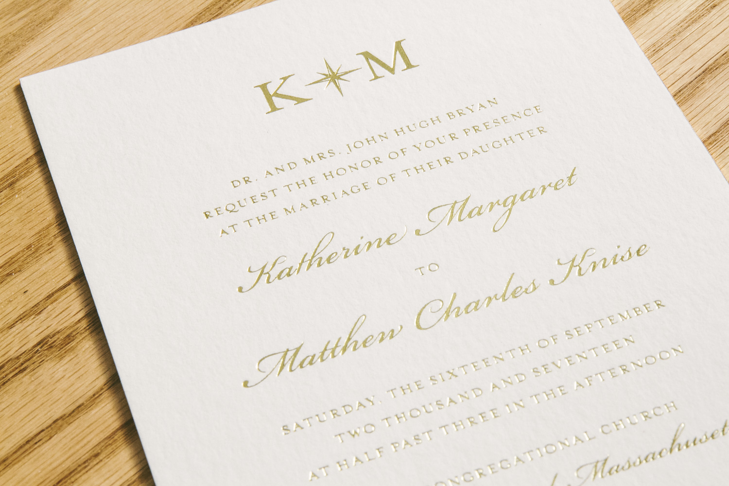
Take elegance, add a touch of nautical flair, and you’ll find Katherine and Matthew’s suite as the beautiful end result. You can never go wrong with classic gold foil stamped wedding invitations, but this couple decided to add their own twist by including a belly-band featuring an exquisite painting of Nantucket Island. The suite included other nods towards Nantucket like the motif of the island on the weekend celebration card and the nautical monogram on the invitation and thank you card. These kinds of accents made the suite harmonious in an incredibly tasteful way thanks to the help of Parchment Fine Papers. The watercolor envelope liner printed in Sea Mist was yet another subtle yet complimentary means of tying everything together.


foil stamping color: gold shine | digital ink color: CMYK | fonts: Cameron, Worthington | paper: 1 ply white bamboo, 2 ply white bamboo | size: S8 | envelope liner: Watercolor 6 in Sea Mist | customization: 38415 | Parchment Fine Papers
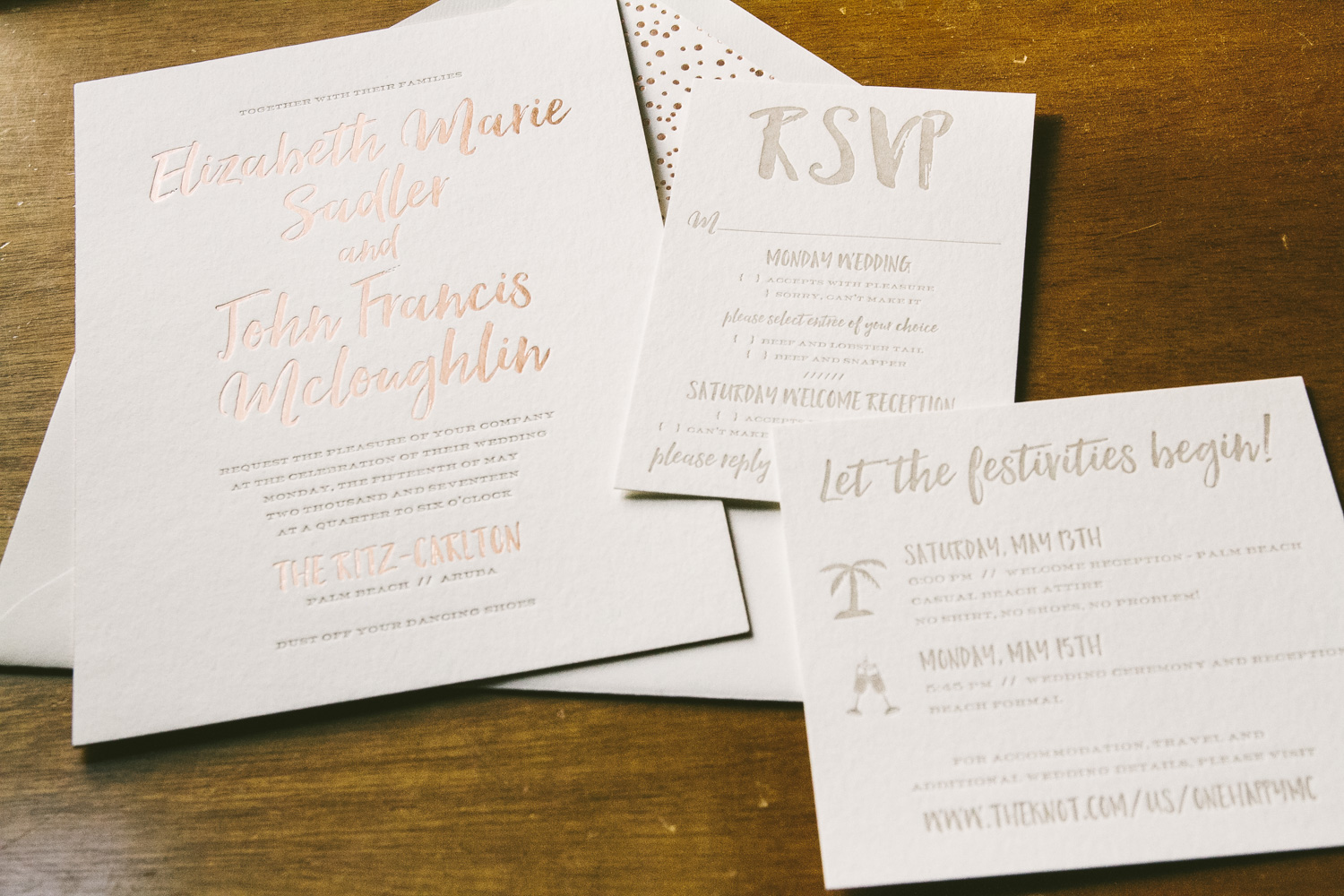
Elizabeth and John personalized our Prospect invitation suite to set the stage for their wedding at The Ritz-Carlton in Aruba. These rose gold wedding invitations were created thanks to the help of our friends at Fete Collection. The breezy script font combined with the more formal serif font gave the invitation a relaxed yet luxurious aesthetic. The additional pieces all printed in Jute letterpress mimicked the color of the sand guests will surely enjoy during their stay in Aruba. A rose gold envelope liner printed in our pearl pattern was a playful addition to the set. We can already hear the sound of the ocean’s waves and feel the sand between our toes after creating this wedding suite!


foil stamping color: rose gold shine | letterpress ink color: jute | fonts: Hello Beautiful + Capitals | paper: 1 ply white bamboo, 2 ply white bamboo | size: S8 | envelope liner: pearl pattern in rose gold shine | customization: 37186 | Fete Collection
An engagement is certainly a cause for celebration and what better way to set the tone for a party than with these botanical foil stamped engagement invitations. We were thrilled to work with Fresh Ink to create this Greely inspired set for Michelle and David. Tawny Matte has never looked better as the foil color enhances our Smock Gray paper with its champagne undertones. A sweet floral motif frames the couple’s monogram at the top of the design, while the gold leaf metallic envelope liner adds a polished finish to this lovely customization.


foil stamping color: tawny matte | fonts: Velvet Hammer + Didot | paper: 1 ply Smock Gray | size: S-8SQ | envelope liner: metallic gold | customization: 37196 | Fresh Ink
Our friend Desiree Jacobs at Heirloom Paper Company took our Amira design and put a fresh spin on it when designing these foil stamped Bar Mitzvah invitations for Jonathan. Instead of keeping the orientation vertical, they decided to hold the card horizontally, creating a unique take on the original design. The background was printed in Peacock, which was a perfect compliment to the Tawny Matte foil wording over top. The vibrant Peacock color was then carried onto the reply card and to the pattern on the envelope liner that tied everything together beautifully. A memorable monogram was also formed from the Hello Beautiful script which added a touch of whimsy to this charming set.


foil stamping color: tawny matte | letterpress ink color: peacock | digital ink color: peacock | fonts: Hello Beautiful, Shaw | paper: 2 ply white bamboo, 1 ply white bamboo | size: S8 | envelope liner: Mondsee pattern in Peacock | customization: 37238 | Heirloom Paper Company
Sarah and Brett’s wedding was held at The Villa at Sunstone Winery in Santa Ynez, California. These bronze foil wedding invitations were the perfect first impression of what their big day would hold that coming June. With the bride and groom’s name first and foremost on the page dressed in a modern, free-flowing font, it’s easy to see that this wedding will be a sweet yet sophisticated affair. When their guests turn over the invitation, they will find a botanical pattern repeated in bronze shine adding a subtle wow factor. To give the suite a pop of color, our sage ink added another level of appeal to the reply and welcome party cards. The envelope liner was also printed in sage carrying a complementary leaf pattern as the finishing touch.


foil stamping color: bronze shine | digital ink color: sage | fonts: Durham, Timber, Greenaway | paper: 2 ply white bamboo, 1 ply white bamboo | size: S8 | envelope liner: watercolor leaves in sage | customization: 37610 | Events
To announce the graduation of J. Clayton Kennedy, these letterpress graduation invitations were sent to set the stage for a celebration to come. With Cornell as his alma mater, it only made sense that cardinal was chosen as the primary letterpress ink color within the design. Not only was this a celebration for J. Clayton, but it was also a way to honor the lives of both Barbara and Keith Kennedy who graduated from Cornell as well. Our Ivy League font emphasized this academic anniversary along with the mascot for an extra touch of school pride. The choice to keep the envelope liner simple in our Seneca pattern gave the suite an overall clean and polished aesthetic. We couldn’t have been happier to work on this set with our friends at the Preppy Pink Pony.


letterpress: Cardinal, Mocha | fonts: Gotham, Ivy League | paper: 2 ply white bamboo, 1 ply white bamboo | size: S8 | envelope liner: Seneca pattern in cardinal | customization: 38156 | Preppy Pink Pony
There is something to be said for the simplicity of a classic letterpress wedding invitation. That kind of beauty could never be overdone, but we also love when timeless elegance is transformed through the marriage of modern day and old world printing techniques. We were thrilled to work with AGI Events to create these invitations for Ross and Rebeccas’s wedding at the Tribeca Rooftop in New York City. The inclusion of the dreamy watercolor florals added a completely new level of interest to a traditional layout. Using black letterpress as the ink color for the wording was a perfect neutral against the colorful palette of the florals framing the page. To top it all off, an envelope liner with a sweet saying tied everything together to complete this suite.


letterpress ink color: black | digital ink color: CMYK | fonts: Parfumerie, Serlio| paper: 2 ply white bamboo, 1 ply white bamboo | size: S8 | envelope liner: custom pattern in CMYK | customization: 37104 | AGI Events
We can never get enough of patterns that have something to say. Our Sheridan design is all about pushing that envelope even further with its modern geometric flair. Melissa and Yuki decided that this design would be the perfect fit to reflect their wedding held at the Four Seasons in Scottsdale, Arizona. A digitally printed marble sleeve with Bronze Shine accents gave everything a home in a chic way. While the same contemporary pattern printed on the sleeve was carried onto the reply envelope as well as the menu. The unique diamond structure was used as the actual shape of the menu for another wow factor within their wedding stationery. Thanks to the help of Mrs. Post Fine Stationery & Gifts, we were able to create a suite that will surely leave their guests talking.


foil stamping color: bronze shine | digital ink color: cmyk | letterpress ink color: taupe | fonts: Gotham, Mina, Avenir | paper: 1 ply white bamboo | size: S8-Q | customization: 36774 | Mrs. Post Fine Stationery & Gifts
A 50th birthday often requires a grand celebration and Dianna’s big day was no exception to this. Her glamorous foil stamped invitation suite gave her guests a sneak peek into what was to come using our Avignon design. With Dianna’s name stretching across the card in an elegant script font, foil flourishes swirling as if they were about to float off the page, it’s evident that she is somebody worth celebrating. When guests open their invitation, they’ll be surprised to find a sweet poodle motif shining back at them in Gold Matte foil. It was hard not to smile while working on this charming set with Uptowne Papers!


foil stamping color: gold matte | digital ink color: pearl | fonts: Worthington + Belissima | paper: 2 ply white bamboo, 1 ply white bamboo | size: S8 | envelope liner: Custom pattern in gold matte and pearl | customization: 37216 | Uptowne Papers
Tiffany and Paul personalized our Wessox invitation suite to fit their traditional Nantucket wedding. These timeless foil stamped wedding invitations came together thanks to the help of Gus and Ruby. To give the invitation a little extra love, they decided to add a simple yet elegant blind deboss border to the design. The touches of a damask pattern in cloud letterpress added a luxurious finish to the welcome dinner and reply cards. The best part of it all? A different type of border was featured on each piece to create a cohesive overall look to the suite without being too matchy-matchy.


foil stamping color: gold shine | letterpress colors: cloud, blind deboss | fonts: Capital, Etienne | paper: 2 ply white bamboo, 1 ply white bamboo | size: S8 | customization: 32221 | Gus and Ruby


