Printed for our friends over at Paper and Chocolate, this blending of Palmes and Fitzroy features gorgeous copper shine foil stamping. Copper foil sometimes tends to get the cold shoulder while Gold foil gets all the love, but really copper has an amazing richness and uniqueness that sets it apart beautifully from the Golden crowd.
foil: copper shine | paper: 2-ply ivory | fonts: cranbrook block + plaza calligraphy font | printing: foil stamping | invite size: s8 | corner rounding | envelope liner: metallic champagne | customization #: 15860

Our friends at By Invitation Only in Arkansas submitted this beyond beautiful Cavall invitation suite. The feeling of long standing traditions and a classic approach have created these. We’ve rounded the corners of the cards and the invitations are edge painted in midnight for the perfect finishing touches.
inks: inkless blind deboss + midnight | font: submitted calligraphy | paper: 2-ply ivory | printing: letterpress | corner rounding | edge paint in metallic gold | invite size: S7 | customization #: 15704

Preppy Pink Pony sent us these wonderful custom Costa Rican inspired wedding invitations. The set is highlighted by an offset map of the country itself on the folio. A perfect first impression for a wedding that was obviously a great time!
inks: pool + blind deboss | fonts: clementine + graham | paper: 2-ply ivory + 1-ply ivory | printing: letterpress + offset | invite size: S7 folio | folio: offset in pool | customization #: 16312

Though the invitation is pretty in its own right, with its die cut shape and metallic edging, the real star of this set is the folio interior. Annie from Hitched worked with our graphic design team to create this unique and elaborate map of the Washington D.C. metro. Offset maps are becoming more and more popular for envelope liners and folio interiors.
ink: taupe | fonts: submitted artwork | paper: 1-ply white | printing: letterpress | edge painting in metallic gold | invite size: S7 Chesapeake die cut | folio: custom map in offset taupe | customization #: 16294 |

Check out these Dawson letterpress save the dates from our friends at Fine Line Stationers. They show us that even small cards can set a huge tone for your special day.
inks: navy + spring | fonts: carrington + smock plaza calligraphy font | paper: 2-ply ivory | size: S5 | printing: letterpress | customization #: 15451 |

We were excited to print this custom artwork submitted by RSVP Today. The whimsical floral pattern paired with our Plymouth die really enhances the overall look of the invitation. The additional pieces are charming and perfectly correspond with the invite in the sweetest color palette.
inks: sea mist + silver | paper: 2-ply white | printing: letterpress | custom supplied art | invite size: S8 Plymouth Die | customization #: 16105 |

This nautically themed letterpress wedding invitation suite was brought to us by our friends at Gus & Ruby Letterpress. The use of the anchor and rope motifs throughout the suite do wonders in keeping a consistent theme throughout.
inks: midnight + gold | fonts: mina + inigo | paper: 1-ply ivory | printing: letterpress + offset | invite size: S7 for folio | folio: offset in gold + midnight | customization #: 16047

This masculine and minimalist letterpress stationery is so classic we just needed to share. Sweet Paper sent us this order our way and we couldn’t be happier with the result.
ink: pewter | font: engravers | paper: 2-ply white | printing: letterpress + offset |corner rounding | size: S6 | customization #: 15711 |

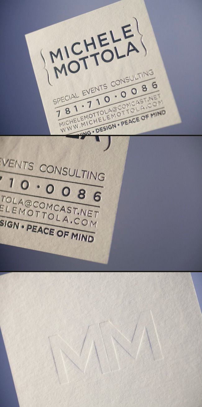
These awesome business cards were sent to us by a great store Invitations & Company in Massachusetts. The use of two sided printing in foil and letterpress make these a business card worth taking a second look at.
letterpress ink: blind deboss | foil: silver shine | fonts: customer supplied | paper: 2-ply white | size: 3 x 3 | printing: letterpress + foil stamp | customization: 16281

Another beautiful set from Pretty as a Picture! Ailbhe sends us more custom artwork and finds ways to make each piece of this set individually unique. Somehow this set looks like more than just two colors. Perhaps it’s the clever use of negative space on the inside of the folio, bringing ivory butterflies through the offset pearl ink. This was a very popular set and serves as a great example of how much you can achieve through the right colors and layout.
inks: pearl + pewter | fonts: meaculpa rob + shaw | paper: 1-ply ivory | printing: letterpress + offset | submitted artwork | invite size: S7 | folio: letterpress + offset in taupe + pearl | customization #: 11535 |


