Jessica and Adam chose our Ashbourne design to set the tone for their cozy autumn wedding, and created a full custom invitation suite and programs in a soft color palette of pewter and sand inks. Guests cozied up with white blankets on the grounds of A Private Estate for the couple’s riverfront ceremony, then made their way to the barn for the cocktail hour with warm mulled sangria in hand. Inspired by their love of local food and wine, the elegant farm to table reception featured a unique trios of salads and desserts, which were artfully served up on striking wooden plates by Michael Scott Catering. We can’t get enough of all the beautiful details that went into this wedding — especially the amazing florals by Saipua! Be sure to visit the Cappy Hotchkiss blog to see even more images from this celebration!


Venue: A Private Estate | Wedding Planner: AAB Creates | Photographer: Cappy Hotchkiss | Dress: Temperley London | Bride’s Shoes: Kate Spade | Flowers: Saipua | Cake & Catering: Michael Scott Catering | Make Up: Stanford Smith at Smooth Skin Company | Hair: Laureen at Styles on B | Groom’s Suit: Ralph Lauren | Groom’s Shoes: John Varvatos | Flowergirl Dress: JCrew | Bridesmaids’ Dresses: Amsale | Jewelry: Jenny Packham drop peal earrings | Kattubah: Ketubah.com | Invitations: Smock | Guest Accommodations: Beekman Arms hotel in Rhinebeck, the oldest Inn in America. | Officiant: Rabbi Bradley Hirschfield | Music: Rhythm Collective | Recessional Music, Cocktail Music, and Hora: A Klezmer band called Symphonia Orchestra & Entertainment
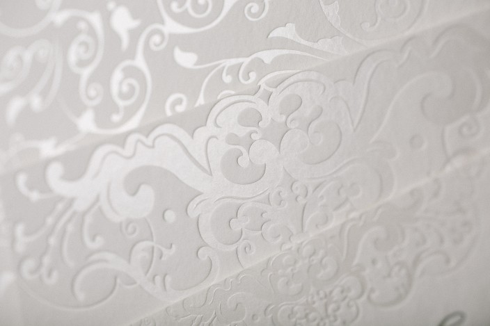
Jade and Matthew combined two of our designs to create their elegant wedding invitations. Their invitations and combination reply + reception cards feature our Galena design, with design accents highlighted in subtle pearl shine foil. We created a Gosford stlye invitation sleeve featuring the names of the bride and groom inside of a simple cartouche and surrounded by the pattern from our Avella design. Metallic glass envelope liners added a final hint of shimmer to this timeless set.


letterpress ink: pewter | foil color: pearl shine | fonts: Smock Plaza + Cranbrook | paper: 1-ply + 2-ply white | size: S-8 + S-5 | sleeve: avella design in pewter letterpress + pearl shine foil; gosford style | envelope liner: metallic glass | customization #28037 | No Regrets
We were thrilled to see our Mr. & Mrs. coasters and our Gold thank you notes in the Fall 2015 issue of Weddingbells magazine! Our letterpress and foil stamped cards and coasters were included in a spread all about the different types of printing options available, including digital printing, foil stamping, and letterpress printing. Thanks again to Weddingbells for the feature – be sure to pick up a copy today!


Samantha and Thomas selected a romantic blush color palette for their July wedding. The couple celebrated at the bride’s family home, and worked with Sweet Paper to customize our Chapman suite. We created chevron invitation sleeves to contain their set, which included invites, reply cards, brunch cards, direction cards, and welcome dinner invitations. Finishing touches included our pink vintage rose patterned envelope liners and corner rounding for a soft, polished look.


letterpress ink: shell | foil color: tawny matte | blind emboss | fonts: Smock Plaza + Barnes | paper: 1-ply + 2-ply ivory | size: S-8 + S-6 + S-5 + S-3 | sleeve: van pattern in dove letterpress; juliette style | corner rounding | envelope liner: pink vintage rose print | customization #27572 | Sweet Paper
For their Aspen wedding, Kelly and Daniel worked with Byrd and Bleecker to create a timeless invitation suite with a dramatic envelope liner. We printed their suite in gold matte foil and espresso letterpress ink, and created an invitation, reply card, and welcome party invitation. The couple kept the invitations and additional pieces simple, opting for a chic, text-based design, and showcased the Rocky Mountains on their stunning gold foil envelope liners.
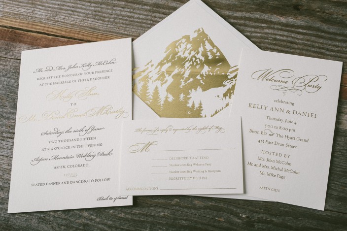


letterpress ink: espresso | foil color: gold matte | fonts: submitted | paper: 1-ply + 2-ply ivory | size: S-8 + S-6 + S-5 | foil envelope liner: custom artwork in gold matte | customization #26938 | Byrd + Bleecker
We’re still all about the ever-popular metallic trend, and can’t get enough of the gold, silver, and copper invitations we’ve been printing these days. One of our favorite shiny metallic looks though? Rose gold – which is why we love this take on our Spence design. Ariel and Joshua worked with Marissa Allie Designs to create their rose gold wedding invitations and reply cards. We printed subtle envelope liners with our vintage world map pattern in jute to match. We love the end result!


letterpress ink: jute | foil color: rose gold shine | fonts: Cooper + Smock Ruby | paper: 1-ply + 2-ply ivory | size: S-8 + S-5 | envelope liner: vintage world map pattern in jute | customization #25779 | Marissa Allie Designs
We customized our Fremont design for Ryan and Christopher’s autumn wedding at the Brant Point Lighthouse on Nantucket Island. Their letterpress suite was printed in olive ink, and we created striped envelope liners in olive and sage inks to complement the stripes used throughout the set. In addition to the invitations, we created folded social notes with a simple monogram, website cards, an events card, and reply postcards. Each piece featured varying stripe designs, and our oak leaf motif added a seasonal touch to these simple yet sophisticated wedding invitations.


letterpress ink: olive | fonts: Percy + Sargent | paper: 1-ply + 2-ply white | size: S-8 + S-6 + S-5F + S-3 | envelope liners: stripe 2 pattern in olive + sage | customization #24538 | Parchment Fine Papers
Danna and Michael treated their guests to a casual 4th of July barbecue for their wedding last summer. We digitally printed a custom map complete with adorable illustrations that was adhered to a red, white and blue invitation folio. Their barn party wedding invitations were actually inserts for the folio, and included a phone number for RSVPs. We love the checkered look on the outside of the folio — perfectly fitting for a barn party celebration!


letterpress ink: cherry + royale | fonts: Ruby + Barnes | artwork: submitted | paper: 1-ply white | size: S-8 + S-6 | folio exterior: custom pattern in cherry; folio interior: fleming pattern in royale | customization #22078 | Arabesque
We created matching save the dates and ombré wedding invitations using our Spence design for Kasey and Adam’s Stone Harbor wedding celebration. The entire set was printed with gold matte foil, and the main two pieces included a pretty peach ombré fade. We duplexed the invitations to make them ultra thick, then added corner rounding and gold matte foil edging for a polished finish.


foil color: gold matte | digital printing: ombre pattern in peach ink | fonts: Smock Plaza + Lazlo + Stockton | paper: 1-ply + 2-ply white | size: S-8 + S-6 + S-5 | corner rounding | foil edge: gold matte | envelope liners: champagne metallic | customization #27102 + 24836 | Nota Bene
Today we’d like to thank Wedding Bells Magazine for including our Dots table cards and a customization of our new Sutherlin wedding invitation in their Spring/Summer 2015 issue! Their 30th anniversary issue highlighted a “haute list” feature with the best new ideas for 2015, including categories dedicated to stripes and sparkle. Visit Wedding Bells to check out more of their 2015 wedding trends today!

