Nole Garey, editor and publisher of Oh So Beautiful Paper, gave this fantastic invitation set first place in our design contest! Nole loved the texture and the playful yet elegant mix of patterns for this wedding invitation set, and we couldn’t agree more – it’s simply stunning!
Danielle from Creative Touch Party Design in Palm Beach Gardens, Florida always sends us gorgeous designs, and this set is no exception. Much of the inspiration for this design was pulled from Smock’s Dawson suite, sleeve and all. Layers of dynamically designed pieces in this suite really bring it to life, and the colors of pewter and merlot give the playful patterns a little sophistication.
Danielle gave us the scoop on the inspiration behind these invitations. “The wedding colors are shades of wine and berry with silver. The wine color comes from her Lulu Kate bridesmaid dresses, which are just beautiful. These were the inspiration for the border color. The gray picks up the silver throughout the wedding decor. And the men are wearing gray tuxedos, which is reflective in the pocket she chose. The linens are a modern lace pattern which is reminiscent of the quilting in the invitation itself.”
We loved this set — congratulations, Danielle! And a huge thanks to Nole for judging the contest!
Customization = letterpress inks: merlot + pewter | fonts: carrington + smock clermont | paper color: white | paper size: s-7 for sleeve | envelope liner: ashford reversed in pewter | sleeve: custom design in pewter letterpress

This design won first place in our Smock design competition for the first half of 2012. This twice-a-year competition recognizes outstanding and inspired designs submitted by our beloved dealers.
Our second place design contest winner comes to us from Shelley at /di’zain/ loft limited in the Republic of Trinidad and Tobago, a recent addition to the Smock family. The couple chose a dreamy color palette of dusty pinks and greys for their wedding, so invitations in pewter and shell inks on our white bamboo paper fit their theme perfectly and created a soft, sweet feel. The invitation design was modeled after a vintage, “fashionably chic” handwritten love letter, which seems perfectly fitting for Clare-Ann and Joshua as they have had to experience the challenges of an overseas relationship. Shell envelope liners and a pretty script font reminiscent of elegant cursive handwriting complete the look of the invitations.

The couple strove for a sense of romanticism with their invitations, and we definitely think they’ve achieved it! We fell in love – and so did our contest judge, Nole, at Oh So Beautiful Paper, who selected the design as the 2nd place winner. She writes, “The invitation has a clean and modern layout, and I love the use of script and serif fonts that keep the design from looking too fussy. Sweet and simple.”
Congratulations Shelley, and best wishes to the happy couple!
Congratulations again to Di’zain Loft Limited for taking 2nd place in our design contest. This twice-a-year competition recognizes outstanding and inspired designs submitted by our beloved dealers.
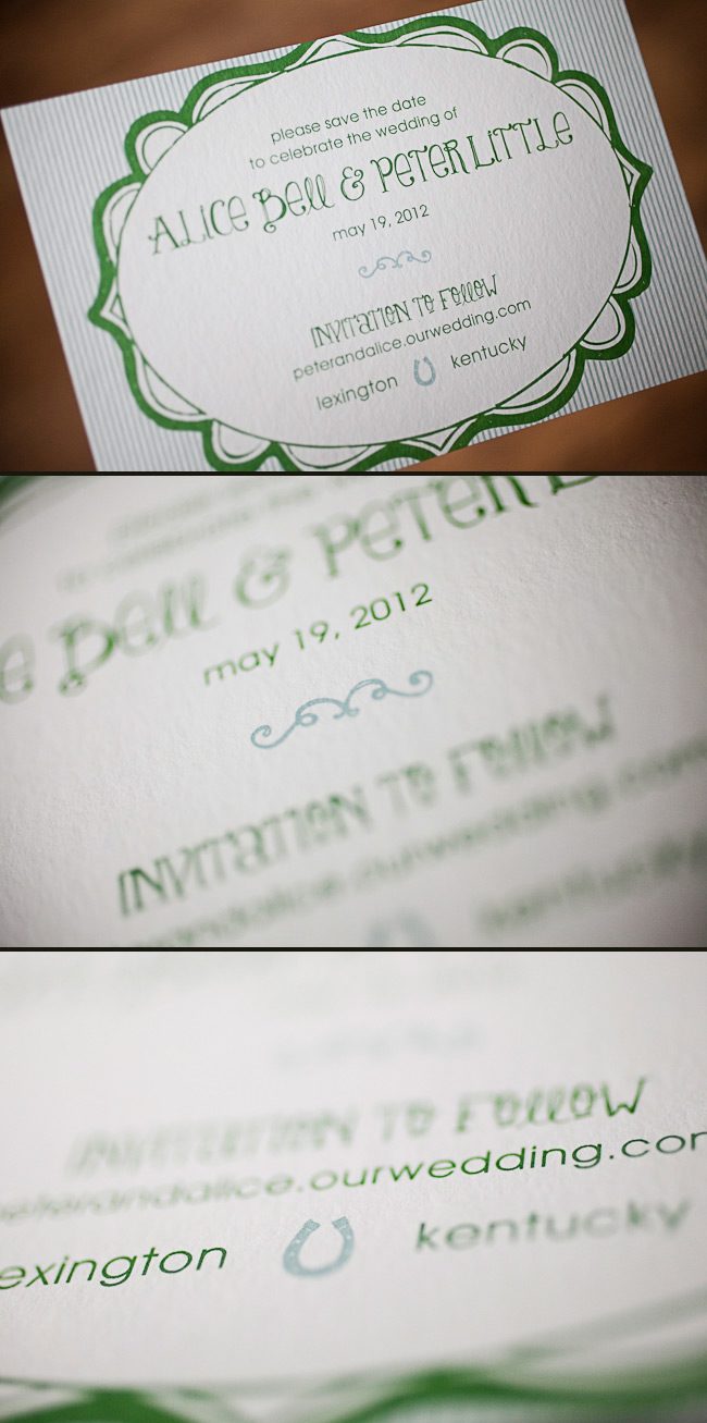
Cori at Social Graces in Nashville, Tennessee sent us this adorable Odin customization! These offset printed save the dates are both personalized and creative, and were printed in a very cool color palette of our sea mist + grass inks. When we asked Cori what inspired this design she told us that the bride was drawn to the fun font style and whimsical frame, and loved how these elements balanced the striped background. The wedding reception will be on her family’s horse farm, so the couple thought it would be appropriate to include a horseshoe. Here at Smock, we believe these save the dates are lucky! Common legend is that keeping the ends of a horseshoe point up keeps all of the good luck in. Congrats to the lucky bride and groom, and bravo to Social Graces for such an inspired design!
inks: sea mist + grass | fonts: mack + louise | paper: 1-ply white bamboo | printing: offset | size: s6

This design won an honorable mention in our Smock design competition for the first half of 2012. This twice-a-year competition recognizes outstanding and inspired designs submitted by our beloved dealers.
We featured these stunning letterpress invitations back in October and are thrilled to show them off one more time as a design contest honoree! This sophisticated set was sent to us by Darcy at Pearl Beach Paperie in Orlando, Florida, and features charming vintage airplanes and a rich color combination of cherry and black inks. The swirls and flourished fonts set a whimsical tone which balances the chic gold stripes printed on the folios and envelope liners. Congratulations and thank you to Pearl Beach Paperie for sending us such a lovely invitation set!
ink: cherry + black | fonts: custom| paper: 2-ply ivory | printing: letterpress | folio exterior: custom pattern in cherry | folio interior: custom pattern in gold | liner: custom pattern in gold |invite size: 5.125 x 7.75 |

This design won an honorable mention in our Smock design competition for the first half of 2012. This twice-a-year competition recognizes outstanding and inspired designs submitted by our beloved dealers.
Randi, owner of the Printed Page in Atlantic Beach, New York customized a bright and beautiful bridal shower invitation for her daughter, Kelly. We often design small cards for our Smock dealers in order to display our promotions, and the card that we designed for our free envelope printing promotion just so happened to inspire Randi.
Randi had mentioned that the shower would be held in April and would have an “April showers” theme. She explained that the party favors were going to be pink and yellow umbrellas and wanted an elegant invitation to tie everything together. She states, “The inspiration came from one of your designs that reminded me of a modern heart. Since this is a shower invite, I thought it was both feminine and relevant. I bought pink and yellow umbrellas for give away gifts for all of the guests, and I am attaching hang tags with the same design to the umbrellas with ribbon. The tags will be the place cards and the umbrellas will add color and fun to the place card table!”
Randi, congratulations to you and your daughter! These invitations are perfect!
customization = letterpress inks: azalea + yolk | fonts: spence + cooper | paper color: white | paper size: s-6 | edge painting: yolk | envelope liner: sherbrooke reversed in yolk

This design won an honorable mention in our Smock design competition for the first half of 2012. This twice-a-year competition recognizes outstanding and inspired designs submitted by our beloved dealers.
We printed these simple, yet elegant, birthday announcements for our friend Linda Chamlin at LS Amster Company. They were offset printed in our Espresso and Heliotrope inks. They are a beautiful way to welcome an 18th birthday.
inks: espresso + heliotrope | fonts: estrella + cooper | paper: 1-ply white | printing: offset | invite size: S-5SQ

We’re thrilled to introduce our new “change the world” letterpress card series, where we’ll donate 100% of profits to a critical environmental issue. The first card in our series is called Sunflower, and will benefit the Pesticide Action Network North America (PANNA).
Here’s the problem: Honey bees are in trouble — colonies have been collapsing mysteriously and adult bees are disappearing. The problem started in the mid 2000’s and is known as “Colony Collapse Disorder,” and researchers believe that pesticides, habitat loss, pathogens and immune system damage are factors that may be causing the collapse.
Why you should care: Of the 100 crops that provide 90% of the world’s food supply, over 70 of those crops are pollinated by bees. In the United States alone, the bees’ contribution is valued at over $15 billion, and this vital industry is on the verge of collapse. One out of every three bites of food are dependent on honey bees for pollination, so government action is critical to help the colonies recover.
Take action now:
- Sign this petition to help protect the bees. By doing so, you will encourage the U.S. Environmental Protection Agency (EPA) to enforce restrictions (such as not spraying while pollinator-dependent crops are in bloom) and to take action against pesticides that are toxic to the honey bees.
- Get informed: learn more at PANNA.
- Start your own bee-friendly garden: Grow plants (like sunflowers!) to help the bees out. Download this handy brochure from PANNA for some bee-friendly gardening tips.
- Make a contribution: help PANNA continue their program work by making a direct contribution, or purchase our sustainably printed Sunflower cards — 100% of profits will be donated to PANNA to help save the honeybees, and organic, locally grown sunflower seeds are included with the cards for you to plant.

If you’re looking for a traditional wedding invitation suite – then look no further! We’re head over heels for this simple and sweet letterpressed set submitted to us by our friends at The Dandelion Patch in Reston, Virginia. Letterpressed in black ink with gorgeous mulberry edge paint that acts as the perfect accent to this one color set – we can’t help but swoon! After looking at photos of the The Ritz Carlton in McLean Virginia, where the fabulous wedding was held – we see what a fanciful and lavish venue the couple chose for their special day. Of course we believe tossing our mulberry ink into the mix helps keep this set looking romantic, but this set also encourages the feeling of the winter months. The three letter monogram on both the invitation and letterpress belly band adds another touch of elegance to this striking set!
ink: black | font: smock spencerian | paper: 1-ply white | printing: letterpress | edge paint in mulberry | liner: the champlain pattern in mulberry | letterpress belly band | invite size: S6

Seeing an order become a design is great. Seeing a design become a letterpress printed invitation is better. But when we get to see photos of our invitations in the hands of the happy couple and shots of their important day…well that just reminds us how much the hard work can pay off. Thanks so much to Michele at the Wedding Company in Hong Kong and well done to Adam Sjöberg for Ira Lippke Studios for the amazing camera work! The reception looked gorgeous and we are very honored to have played some small role in making that day special. Read our previous post about the letterpress wedding invitations.
inks: taupe + pearl + whisper | fonts: cameron + carrington | paper: 1-ply ivory | printing: letterpress | size: s8 | 3-color, bilingual invitations |


We printed these lovely pieces for the ultimate take-two wedding. The couples first attempt was thwarted by a hurricane, but, these newlyweds weren’t going to let a little weather ruin their special day. We went back to the drawing board with our friends at Judy Paulen Designs and whipped up these awesome Part II pieces. They combine beautiful offset and letterpress printing in our Navy ink. We were thrilled to be able to help them with their special day, even if the weather wasn’t going to cooperate.
ink: navy | fonts: smock spencerian + graham | paper: 1-ply white + 2-ply white | printing: letterpress + offset


