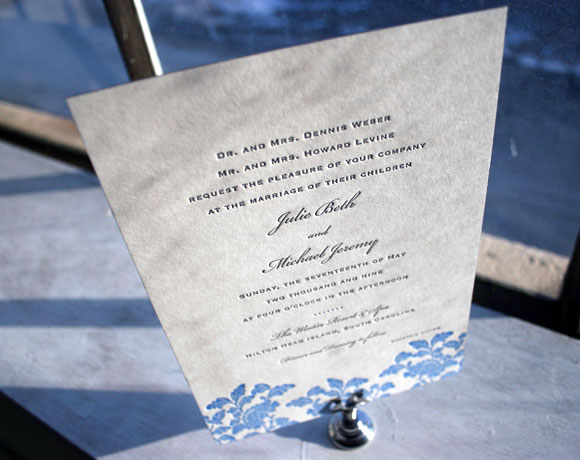
Here’s a great customization of our Rhon letterpress wedding invitation (check out the original Rhon here). The inks are a cool pewter and sky blue (pewter is such a great color to letterpress in!), and the san serif font really gives the invitation a modern elegance.
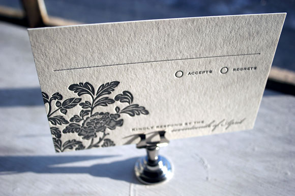
What a great idea to print the letterpress invitation in two terrific colors, and then letterpress the reply card in a single color. This keeps costs down and keep the invitation very, very special. This invitation was sent to us by our friends at the Write Image in Rockville, Maryland.
Want to see other Rhon customizations? Check out the Rhon save the date letterpressed in pewter (a perfect color!) and raspberry; a Rhon letterpress Bat Mitzvah invitation; the Rhon wedding invitation in pewter and grass; and the Rhon letterpress invitation in a custom neutral ink + eggplant. Rhon continues to be one of our best selling letterpress invitation designs this year!
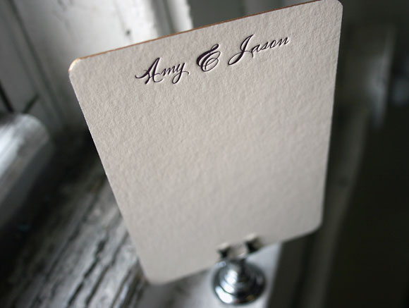
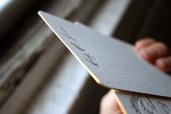
This was a great idea we hadn’t seen before — custom letterpress stationery in the size of a reply card. It seems the PERFECT size to us — sweetly intimate, and just enough room to write a nice personal note (but not too much room!). An extra bonus: it uses less paper than larger social stationery cards (eco!), which also makes it less expensive (nice!). This letterpress stationery is in our Haddington invitation design, using our Smock Spencercian fonts (based on our favorite calligrapher’s penmanship). And the gold edge painting! Oh, gold edge painting makes us swoon — we would like to edge everything we could in gold right now. It adds such an elegant finish to a card. Sent to us by our friends The Write Image in Rockville, Maryland.
Here are a few great ideas from Smock’s client coordinator Tiffany Field that will help keep your letterpress invitation costs down, while still giving you a really wonderful letterpress wedding invitations.
Take a 2 or 3 color design down to 1 color
Many of our 2 and 3 color designs look equally impressive when printed in one color. Fewer colors mean fewer runs through the press which equals less expense. Our designer BethAnn is amazing at this – she knows just what to add and take away so that your design looks just as inviting as its more colorful counterpart.
Splurge on a 2 or 3 color design for the invitation and opt for 1 color accessory pieces
If you absolutely cannot live without a multi-color invitation, opt for your other pieces (reply card, directions card, reception card, etc) to be printed in 1 color. You will get the same impact with your invitation while saving considerably on your additional pieces.
Downsize and use a smaller size card (i.e. a reply card size for save the date)
Some budget savvy friends of ours came up with this idea for their clients’ save the dates and birth announcements, and the idea has really taken off. This is one of my absolute favorite cost cutting options – they are such a sweet little size!
Eliminate the reply card all together and put the contact information on the invitations
This idea is becoming more popular with brides who are not just minding their budget but the environment as well. Printing your reply information in the bottom left hand corner of your invitation is an acceptable alternative that can save you money.
Use a “website card” (usually the size of a place card or reply card) instead of a direction and accommodations card
Website cards direct guests to a site that will feature information related to your event – directions, accommodations, weekend activities, etc. This is a great idea, especially for the brides who have a wealth of information on their websites. From a guest’s point of view, I think they would appreciate that one card can direct them to so much information; I know that trying to keep track of so many invitation inserts can be challenging to many people. This allows them to access information about the wedding at their convenience.
Choose a reply postcard instead of a reply card and envelope
Reply postcards are less $, less postage, less bulk (but also less formal).
Pictured below: #1. Our 2 color Chasseral wedding invitation (on right), letterpressed in one color (on left) // #2. The Cavall letterpress reply card postcard (double-sided) // #3. Sweet, small save the dates (these cards are the same size as a reply card). Engadine design on left; Lashar design on right. // #4. Rhon two color wedding invitation (on left), with 1 color reply card and 1 color direction card (on right)


