Letterpress cards, notepads, and stationery in pretty shades of blue have been extremely popular this year, and it’s easy to see why! This on-trend color works in many different shades: a vibrant, true blue paired with crisp red and nautical patterns appeals to just about everyone, while a deeper navy and rich royal blues work well for men (or for women who like deep, rich colors!). For a fresh, feminine look, lighten things up a bit and go with turquoise. Which shade of blue are you?

1. Breakers boxes: Small $6, Medium $12, Large $18 | 2. Rhino Letterpress Cards $14 for a 6 count box | 3. Lobster Letterpress Card $4 | 4. Breakers Jotter Notepads $6 for a 2-pack | 5. Pearl Notebook $9 | 6. Phillips Boxed Offset Cards $12 for an 8 count box | 7. Talt Notebook $9 | 8. Chatham Scratchpad $7
All Smock goods are made around Syracuse, New York with the planet in mind: our notebooks and notepads use 100% post-consumer waste recycled paper, and our greeting cards are printed on our exclusive (and sustainable) bamboo paper.
Cori at Social Graces in Nashville, Tennessee sent us this adorable Odin customization! These offset printed save the dates are both personalized and creative, and were printed in a very cool color palette of our sea mist + grass inks. When we asked Cori what inspired this design she told us that the bride was drawn to the fun font style and whimsical frame, and loved how these elements balanced the striped background. The wedding reception will be on her family’s horse farm, so the couple thought it would be appropriate to include a horseshoe. Here at Smock, we believe these save the dates are lucky! Common legend is that keeping the ends of a horseshoe point up keeps all of the good luck in. Congrats to the lucky bride and groom, and bravo to Social Graces for such an inspired design!
inks: sea mist + grass | fonts: mack + louise | paper: 1-ply white bamboo | printing: offset | size: s6

This design won an honorable mention in our Smock design competition for the first half of 2012. This twice-a-year competition recognizes outstanding and inspired designs submitted by our beloved dealers.
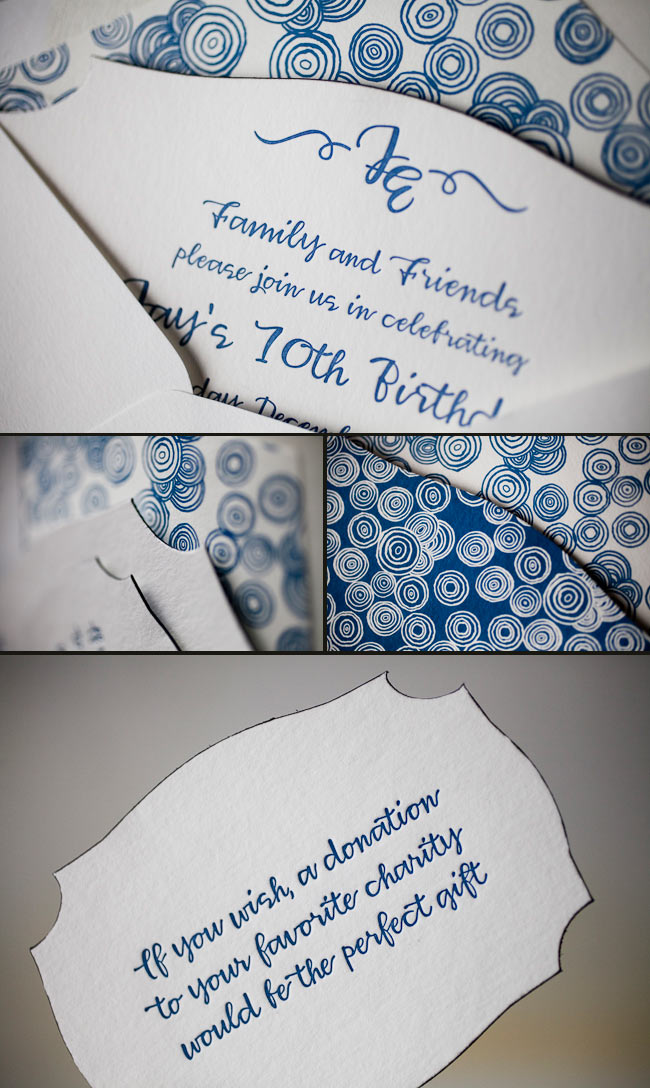
Take a peek at these vibrant and high spirited save the dates! We have Melanie at Salutations in Charlotte, North Carolina to thank for these beauties! We were even able to get a bit of a back story to find out where the inspiration came to create a design so eye catching and brilliant. The bride loved the bold pattern of our Evans design and wanted to use our robin’s egg ink color to truly make a statement. We love to see couples choosing more modern and chic designs for their save the dates, even when they’re planning on sending a super formal invitation suite like these guys are planning. The happy couple said that their save the dates totally matched their fun and bubbly personalities — and we couldn’t agree more! Thanks so much to Salutations for sending us such a fun save the date set — we can’t wait to see the invitations!
inks: robin’s egg + black | fonts: chaplin + carrington + smock harrison | paper: 2-ply white | printing: letterpress | liner: the sinclair pattern in robin’s egg | size: S6

This design won an honorable mention in our Smock design competition for the first half of 2012. This twice-a-year competition recognizes outstanding and inspired designs submitted by our beloved dealers.
Submitted to us by our good friend, Elle at Petite & Sweet in Toronto, Canada these letterpressed Hekla baptism invitations are downright swank! I mean talk about being up-to-the-minute! These invitations showcase our royale and inkless blind deboss inks – and the end result makes for some of the most chic invitations we’ve had the joy of printing in quite some time. The envelope liner adds another nice modernistic touch to this anything but simplistic set! We think these invitations are the perfect prelude to such a memorable occasion – and helped achieve the vision the proud parents were hoping for. We look forward to many more unique and current customizations from Petite & Sweet!
inks: royale + inkless blind deboss | fonts: shaw + social | paper: 2-ply white bamboo | printing: letterpress | edge painting in royale | liner: the ridley pattern in royale | invite size: S8

With a pairing of our navy and azalea inks we have a real beauty on our hands! These lovely letterpress save the dates were submitted to us by our great friends at By Invitation Only in Little Rock, Arkansas. The couple chose our willoughby pattern for the top and bottom of their save the dates – which we think adds a real elegant factor. We can’t get enough of this stunning color combination because it’s not overly feminine and has just a touch of boyish charm – within the navy ink. And we’re all about couples sending their save the dates early – it’s customary to mail save the dates six months to a year before the big day. This allows your guests enough time to book their accommodations, save enough spending money and request time off work. Mailing your save the dates early also allows your guests to count down the days til the “I Do’s”.
inks: navy + azalea | fonts: cahun + shaw | paper: 2-ply white | printing: letterpress | size: S6

Get ready to blow out those birthday candles! Check out these recently printed birthday party invitations submitted to us by our friends at Judy Paulen Designs in New York, NY. Our plymouth die cut adds even more boyish charm to an already youthful looking birthday party invitation. We can’t get enough of the granby backing patterning in navy, and take a look at the envelope liner in reverse granby in navy-for another super cool customization. Alright now, let’s get the party started!
inks: navy | fonts: smock harrison | paper 2-ply white | invite size: S-6 | printing: letterpress | die cut: plymouth | back pattern: the granby pattern in navy | edge paint: black | liner: the reversed granby pattern in navy
It’s easy to get in the party mood when seeing these custom and vibrant offset invitations! These colorful invitations were submitted to us by our great friend Kerri at Anne Grace Designs in Dallas, Texas. We think you’ll agree that the color combination of coral and robin’s egg brings the perfect balance of bright hues. Not many people are aware that seahorses are a symbol for happiness and these invitations definitely have us feeling good vibes. Now, who’s ready for a fiesta?
inks: coral + robin’s egg | font: coombs | paper: 1-ply white | printing: offset | size: #10

Our great friend, Toni at The Write Image in Rockville, Maryland submitted these breathtaking Sabion letterpress invitations to us. Our midnight and lavender inks print beautifully on our thick 2-ply bamboo paper. The couple chose to coordinate their set with two cards that were printed with the lavender front patterning and then two cards were printed with only midnight ink – which makes for a peppy look with contrasting pieces! Corner rounding and a beautiful patterned envelope liner in midnight complete this suite.
inks: midnight + lavender | fonts: poetica and therese | paper: 2-ply ivory bamboo | printing: letterpress | front patterning: sinclair in lavender |corner rounding |liner: the rousseau pattern in midnight | invite size: S8

Lose your heart in San Francisco with these recently printed custom letterpress wedding invitations designed by Lindsy Aragona, who is just one of our many wonderful in-house designers. This ultramodern and whimsical set was submitted to us by our great friends at Union Street Papery in San Francisco, California (would you have even guessed?). The San Francisco Bay Bridge is letterpressed in our lovely coral ink and the bubbly persona is carried through onto all pieces. They say people go crazy for a great city like San Francisco-and we’re just as crazy for this imaginative set!
inks: coral + peacock | fonts: clementine and stockton | paper: 1-ply ivory bamboo | printing: letterpress | invite size: S8

Check out this cool letterpress invitation customization made to our Chasseral design submitted by our wonderful friends at Write for You in Washington DC. We’re so in love with the gorgeous hues and the way the falling vines in turquoise ink cascade down the invitation. Changing the orientation of this invitation to landscape adds to the simple elegance of this truly remarkable invitation.
ink: turquoise| fonts: graham + cameron| paper: 2-ply ivory | printing: letterpress | invite size: S7


