Lauren and Thomas used our Ashbourne design as the inspiration for their nautical letterpress wedding invitations created thanks to the help of Fat Cat Paperie. They kept the Sand letterpress border and combined this with Navy letterpress as a seafaring nod to their reception venue of Peconic Bay Yacht Club. Other subtle yet purposeful touches include the compass, starfish and anchor motifs found on the weekend festivities card also printed in Navy letterpress. The reply card was kept simple and clean as another piece within the suite. They added an envelope liner pattern as a sweet way of incorporating a map of the area with heart motifs highlighting places of importance to the bride and groom. It’s easy to say that Ashbourne was the perfect invitation inspiration for Lauren and Thomas’s nautical affair.

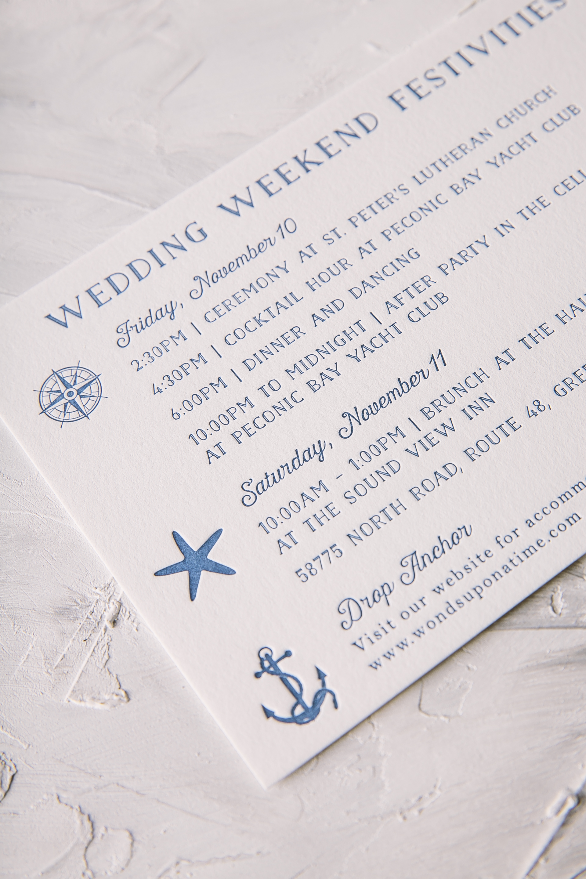

Letterpress color: Navy + Sand | Fonts: Nave Inline & Harriet | Design: Ashbourne | Paper: 2 ply Smooth Cotton, 1 ply Smooth Cotton | Size: S-8 | Liner: Submitted pattern in Jute + Cardinal | Customization: 39496 | Fat Cat Paperie
Marique and Derek’s were married this past January at the Willowdale Estate in Topsfield, Massachusetts. Their
botanical foil stamped wedding invitations reflected the aesthetic of their venue beautifully. A plum letterpress border and a thin tawny matte border added a subtle touch of color yet still complimented the custom pattern scattered within the suite. This Haynes set included a coordinating reply card, rehearsal dinner card and accommodations card, all carrying botanical motifs throughout – including the envelope liner as to wrap everything up. This stunning suite wouldn’t have been possible without the help of our friends at Gus and Ruby!


Foil color: Tawny Matte | Letterpress color: Plum | Fonts: Plaza Script, Social and Carrington | Design: Haynes | Paper: 2 ply Bamboo, 1 ply Bamboo | Size: S-8 | Liner: Custom pattern in CMYK | Customization: 40388 | Gus and Ruby
This past October Jori and Christopher were married at Architectural Artifacts in Chicago. Their venue is filled with a combination of formal yet vintage touches throughout and their refined letterpress wedding invitations reflected the space perfectly. Our Bristen design originally uses Sand letterpress only on the leaf motif, but this couple decided to change it up by throwing Taupe and Tawny Matte accents within the mix as well. To give the traditional invitation layout a little something extra, Tawny Matte was also added to the names of the bride and groom to make them shine among the rest. Guests will find the same leaf motif added throughout the rest of the set to keep everything cohesive and interesting to the eye. Thanks to the help of Quintessence Fine Papers and Gifts, we were able to create an incredibly sweet suite.


Letterpress ink colors: Sand + Taupe | Foil stamping color: Tawny Matte | Fonts: Smock Ruby + Woodland | Design: Bristen | Paper: 2 ply bamboo | Size: S-8 | Customization: 39441 | Quintessence Fine Papers and Gifts
Kate and Dan’s family and friends traveled from near and far to attend their Nantucket wedding celebration this past June. Their nautical letterpress wedding day pieces included programs, menus, table number cards and a details booklet. Each coordinated with the other, using blues such as our Royale and Azure letterpress inks as their color palette of choice. These pieces reflected the easy, laid-back nature of the island with design accents like an organic border around the program and a fun dot pattern for the table number cards. The details booklet added a personal touch with a note from the bride and groom and a list of events scheduled for the weekend. We have no doubt this wedding came together as beautifully as their day of pieces – thanks to the help of Parchment Fine Papers!


Letterpress ink colors: Royal and Azure | Fonts: Nave | Design: Custom Library | paper: 1 ply white bamboo, 2 ply white bamboo | size: S-6 + other custom sizes | customization: 49118 | Parchment Fine Papers
James and Saragh’s wedding invitation suite reflects a monochromatic color palette with green as the leading color. These sophisticated letterpress wedding invitations carry a polished, classic kind of look that will never go out of style. While they decided to keep the cards themselves on the simple side, they played up the envelope liner by using our Payette pattern in Grass to match with the rest of the suite. To give this set a little extra love, a coordinating ribbon held everything together with a hand crafted monogram added as the finishing touch. Thanks to the help of our friend Shayne at Ink Papery, James and Saragh timeless invitation suite is something they will still look fondly at even after years of being together.


Letterpress ink color: Grass | Digital ink colors: CMYK | Fonts: Plaza and Inigo | Design: Custom Created Design | paper: 2 ply white bamboo, 1 ply white bamboo | Liner: Payette pattern in Grass | size: S-8 | customization: 38083 | Ink Papery
Julia and Kevin customized our Prescott invitation for their summer wedding in Vermont. They worked with our friends at Gus & Ruby Letterpress to create a monochromatic look by printing their entire suite in our vibrant grass ink color. A striped envelope liner added a fun, preppy touch to this sweet but sophisticated set.

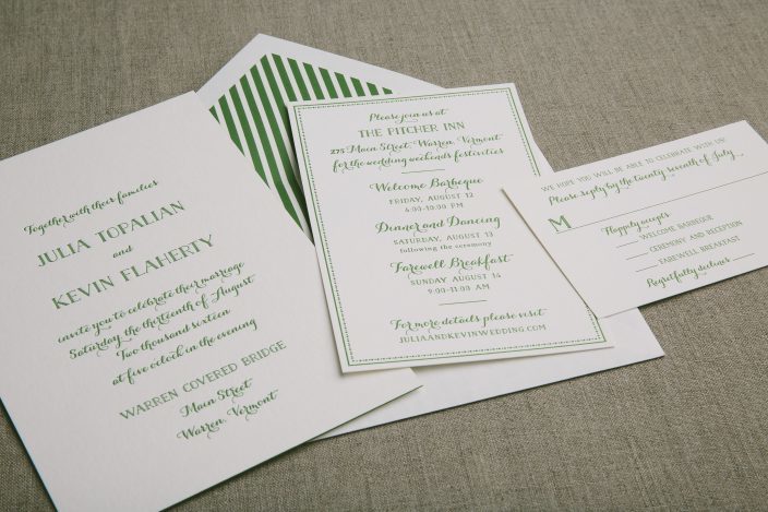


letterpress ink color: grass | fonts: Jules & Naive | paper: 2-ply + 1-ply white bamboo | size: S-8 + S-6 + S-5 | envelope liner: Seneca Stripe pattern in grass | customization #33740 | Gus & Ruby Letterpress
Lauren and Hermes personalized our Halifax invitation suite to set the tone for their October wedding at the Crystal Bridges Museum of American Art. The couple chose classic black letterpress ink on our white bamboo paper for their invitation suite, which mixed our square Belmont die-cut shape on the invitations with our Plymouth die-cut shape on the reply cards. We printed a petite website card to provide guests with information regarding accommodations and wedding day details, as well as a vintage anemone patterned envelope liner to add a splash of color.


letterpress ink color: black | fonts: Wallis + Lawrence | paper: 2-ply + 1-ply white bamboo | size: S-8SQ Belmont + S-5 Plymouth + S-3 | envelope liner: vintage print anemone pattern | customization #33696 | Shindig Paperie
Trying to find the perfect invitation to match your wedding dress style? The Knot has you covered! They put together an amazing post pairing different wedding dress styles with invitations to complement each gown. Our rustic Cimarron letterpress wedding invitation design was paired up with the gorgeous Opal gown by Marchesa Notte for BHLDN. We think it’s a perfect pairing — visit The Knot for more ideas!

Amanda and Neal created a stylish letterpress invitation suite for their September celebration at the Barns at Wolf Trap. We collaborated with our friends at The Dandelion Patch on the suite, which featured sweet script fonts and letterpress printing in midnight ink on our white bamboo paper. The invitations, information cards, brunch invites and response cards were all tucked inside of the suite’s wow-worthy statement piece: a custom floral watercolor invitation sleeve in varying shades of pink, purple, orange and emerald.


letterpress inks: midnight | fonts + design: jules & bronte, custom design + submitted watercolor artwork | paper: 1-ply + 2-ply white | size: S-8 for sleeve + S-5 + S-6 | sleeve: digitally printed juliette sleeve | customization #28686 | The Dandelion Patch
We created a full suite for Michael and Craig’s October wedding at the New England Aquarium using different motifs from our custom library. Their custom invitations paired our pewter and ocean inks together on white bamboo paper, with our coral motif and Harrison calligraphy font adding special touches. The other cards in the suite included our sea turtle, fish, and penguin motifs, which gave subtle nods to the venue.


letterpress inks: pewter + ocean | fonts + design: Smock Harrison + Inigo, custom library design | paper: 1-ply + 2-ply white bamboo | sizes: S-8 + S-5 + S-5F + B-3 + #10 + S-3F | envelope liner: metallic platinum | customization #28530 + #29440 | Invitations & Company