This Burstell customization is truly striking, while nice, crisp lines on the invitation keep the invitation looking minimalistic. This set was submitted to us by our great friend, Jessica at Salutations in Charlotte, North Carolina. The exterior of the pocketfold showcases our grand clairveaux pattern which is letterpressed in our dove ink – making for a subtle, romantic vision. Open the pocketfold to our mondsee pattern which is a bit more modern – but this classic, text based invitation looks absolutely stellar. Our pool ink is a flawless choice- matching back to the couple’s venue at The Cloister at Sea Island. We feel that our pool ink radiates warmth and provides the perfect contrast with our dove ink.
ink: pool | fonts: elsie and inigo| paper: 1-ply white | printing: letterpress | folio exterior: grand clairveaux pattern in dove | folio interior: mondsee in dove| invite size: 5.125 x 7.75

Our Sutton design looks prominent printed in mint and navy inks and we think you’ll find it easy to agree! Our good friend, Jessica at Salutations in Charlotte, North Carolina submitted this letterpress suite to us for printing. The repeating Sutton motif looks almost floral as the invitation background pattern – adding to the ornate feel. On the exterior of the pocketfold – we have offset printed our sinclair pattern in navy – and on the folio interior the classic feel is seen within our sherbrooke pattern also in navy. Blues and greens can be incredibly versatile ink colors when it comes to wedding invitations. Navy ink is a superb choice for a sunset ceremony whereas mint can match back to the fauna at the wedding venue.
inks: mint + navy | fonts: stock + smock spencerian | paper: 2-ply ivory | printing: letterpress| folio exterior: sinclair pattern in navy | folio interior: sherbrooke pattern in navy| invite size: 5.125 x 7.75

If you’re looking for a traditional wedding invitation suite – then look no further! We’re head over heels for this simple and sweet letterpressed set submitted to us by our friends at The Dandelion Patch in Reston, Virginia. Letterpressed in black ink with gorgeous mulberry edge paint that acts as the perfect accent to this one color set – we can’t help but swoon! After looking at photos of the The Ritz Carlton in McLean Virginia, where the fabulous wedding was held – we see what a fanciful and lavish venue the couple chose for their special day. Of course we believe tossing our mulberry ink into the mix helps keep this set looking romantic, but this set also encourages the feeling of the winter months. The three letter monogram on both the invitation and letterpress belly band adds another touch of elegance to this striking set!
ink: black | font: smock spencerian | paper: 1-ply white | printing: letterpress | edge paint in mulberry | liner: the champlain pattern in mulberry | letterpress belly band | invite size: S6

With a pairing of our navy and azalea inks we have a real beauty on our hands! These lovely letterpress save the dates were submitted to us by our great friends at By Invitation Only in Little Rock, Arkansas. The couple chose our willoughby pattern for the top and bottom of their save the dates – which we think adds a real elegant factor. We can’t get enough of this stunning color combination because it’s not overly feminine and has just a touch of boyish charm – within the navy ink. And we’re all about couples sending their save the dates early – it’s customary to mail save the dates six months to a year before the big day. This allows your guests enough time to book their accommodations, save enough spending money and request time off work. Mailing your save the dates early also allows your guests to count down the days til the “I Do’s”.
inks: navy + azalea | fonts: cahun + shaw | paper: 2-ply white | printing: letterpress | size: S6

This gorgeous customization of our Sutton letterpress invitations was sent to us by our friends at Kate’s Paperie and is among the honorees in our most recent Smock Design Contest. It was printed in a custom bright turquoise ink paired with pewter and calligraphy accents for a look that is elegant and formal. We love this fresh and chic color combination for a traditional summer wedding. Many thanks to Kate’s Paperie for working with us on this stunning invitation set!


At long last it’s time to share the winner of our latest Smock Design Contest! This stunning customization of our Kurai letterpress wedding invitation suite came to us from Salutations in Charlotte, North Carolina. The design is printed in sea mist and taupe inks, enclosed in a custom folio featuring our sinclair pattern in taupe on the interior with our signature champlain pattern in sea mist on the exterior. Our special guest judge, Kristen Magee of Paper Crave, shares, “This invitation is ultra elegant, and I love that it’s feminine without being too feminine. The soft florals and script font are delicate, romantic and balance wonderfully with the more straightforward sans serif font and pattern on the pocket fold. The understated color choices are also nicely balanced, making this a design that would appeal to both women and men.”
We can’t thank our friends at Saluations enough for working with us on this incredible design and a huge thank you to Kristen for taking on the difficult task of judging the contest. Stay tuned for our next batch of design contest winners in early 2011!


Eve and Richard were married in January and we’re excited today to share a few photos from their gorgeous Philadelphia wedding, which was photographed by the immensely talented Marie Labbancz. They worked with our friends at The Papery of Philadelphia for their beautiful stationery, using our Nevis design, which we offset printed on our bamboo paper. We love the classic pairing of black ink on ivory paper and the elegant, romantic details Eve and Richard carried throughout their celebration. Check out the Nevis motif on their gorgeous cake!


See more photos of Eve and Richard’s wedding on Marie’s blog.
{Photos by Marie Labbancz.}
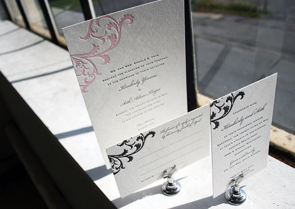
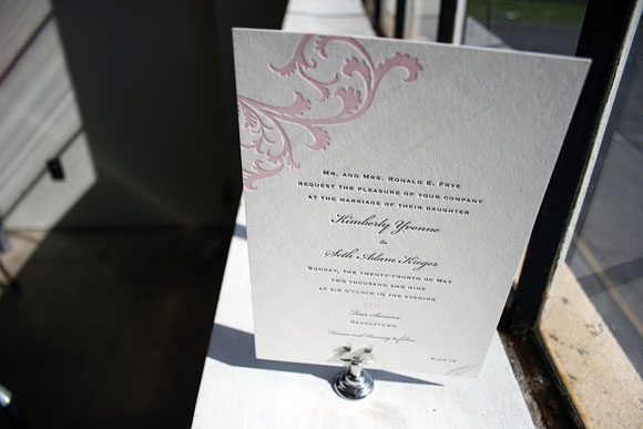
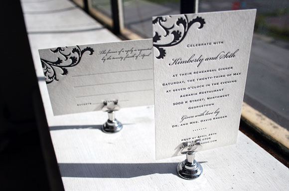
Brought to us by The Write Image in Rockville, Maryland, we love this letterpress wedding invitation set. The letterpress invitation itself is printed in 2-color letterpress in pearl and black inks and showcases a customization of our Vettore motif using a portrait orientation. The reply card and letterpress rehearsal dinner invitation are printed in 1-color letterpress in black ink, a really great way of keeping letterpress affordable without sacrificing style or elegance.