Check out the emerald patterned envelope liner and the letterpressed emerald belly band, where the inspiration for both came from our Altar design. Thanks go out to our friends at RSVP in Roslyn, New York for sending us these to print!
inks: black+ emerald | fonts: carrington stripes + leighton | paper: 2-ply white | printing: letterpress | corner rounding | liner: custom pattern in emerald | letterpress belly band | invite size: S8

We’ve really fallen for these elegant Rhon letterpress invitations submitted to us by our friends at Village Invites in New York City. The cascading vines provide the perfect balance of romance and sophistication to this suite. Tossing in a metallic platinum envelope liner adds a touch of shimmer and makes this set even more stylish.
inks: black + dove | fonts: lazlo + etienne | paper: 2-ply white | printing: letterpress | liner: metallic platinum| size: S8SQ

We recently had the pleasure of working with the Northeast Organic Farming Association of New York on a letterpress invitation set for their 2012 Fall Benefit. We provided pro bono letterpress printing for the invitations, which feature our new Tatra design in azure and orchid inks. This year’s NOFA-NY benefit was held at Back Forty in New York City, and honored Frances Moore Lappé (an accomplished author and cofounder of Food First: The Institute for Food and Development Policy and the Small Planet Institute), as well as Benjamin Shute and Lindsey Lusher Shute (owners of Hearty Roots Farm, a diversified vegetable farm and farm share program. Lindsey is also the Director of the National Young Farmers’ Coalition (NYFC)). Many thanks to NOFA-NY for giving us the opportunity to participate in such a special event!

We want to thank our friends at Georgia Ann’s Paperie for this wonderful baby shower invitation. The lion motif makes this the perfect invitation for such a special event.
inks: turquoise + sea mist | fonts: millicent + chaplin | paper: 1-ply ivory bamboo | printing: letterpress | signature liner: C991-1 | invite size: S6 | customization #: 15153

We’re proud to introduce our new Sunflower calendars as the latest installment in our Change the World letterpress series! These limited edition 8×10 art print calendars are letterpress printed on our ultra thick 2-ply bamboo paper and are on sale for $10 each, and 100% of profits from the calendars will be donated to the Pesticide Action Network (PAN). The calendars celebrate the nonprofit’s 30th anniversary and proceeds will help PAN in their efforts to replace the use of hazardous pesticides with ecologically sound and socially just alternatives. Happy birthday, PAN!

Want to learn more about PAN and ways you can help their mission? Check out this blog post about our Sunflower cards or visit panna.org.
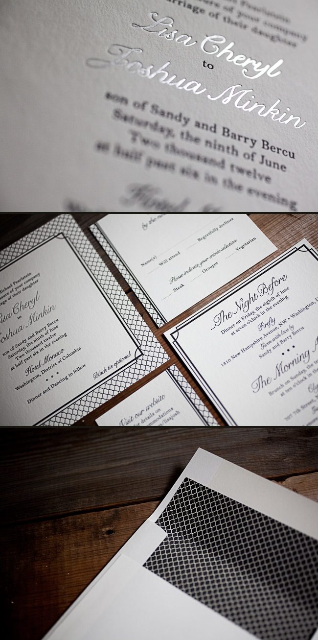
Can we have a drum roll please? Why, you ask? Because we are over the moon excited for the launch of foil stamping at Smock! These custom letterpress invitations feature silver matte foil for the bride and groom’s name, adding just a touch of shimmer to this traditional wedding set. Foil stamping allows us to incorporate the very look of metallics onto custom printing. So now there is truly a way to make your own wedding invitations outshine the rest. Classic black paired with silver matte foil looks impeccable and clean cut on these. We’d like to thank our friends at The Write Image in Rockville, Maryland for sending us this amazing suite.
inks: black + silver matte foil | fonts: graham + alice | paper: 2-ply white | printing: letterpress| liner: custom reverse champlain in black |invite size: S8SQ
Father’s Day is June 17, and we’ve got some great new letterpress cards available just for the occasion! Tell dad just how much he means to you with one of these pretty cards – both read “Happy Father’s Day” on the inside and come with lined envelopes. Be sure to check out all of our man-friendly stationery for stylish paper gifts, too!


We had the fortune of printing these great Evans letterpress wedding invitations for our friends at Epitome Papers. It’s jobs like these that show us that our stores are the creative ones!!!
inks: midnight + inkless blind deboss | fonts: spence | paper: 1-ply white + 2-ply white | printing: letterpress + offset | folio: exterior pattern: willoughby in inkless blind deboss letterpress + interior pattern: willoughby in midnight letterpress | liner: willoughby in midnight offset | invite size: S-7SQ folio

We’re so excited to introduce our newest card in the “Change the World” letterpress card series, where we donate 100% of profits to a critical environmental issue. The second card in our series is called Fracking, and will benefit Earthworks. The cards also come with an anti-fracking tattoo!


Here’s the problem: In the U.S., we’re drilling around 2,000 new oil and gas wells per month. 90% of these new wells use a process called “hydraulic fracturing”, also known as fracking. To get the natural gas out of the ground, fracking requires 3-15 million gallons of water plus a lot of chemicals. Rarely do we know what these chemicals are; the oil and gas industry is exempt from the Safe Drinking Water Act, the Clean Water Act, the Clean Air Act, and the Superfund law. A large percentage of this chemical laced water remains in the crevices of the earth, soaking into the ground, and threatening our clean water supply.

Is there a realistic solution? Fracking is scary, but it’s only part of the problem – change needs to happen. Earthworks’ Oil & Gas Accountability Project is working to reform the entire oil and gas industry. Earthworks believes that corporations should be allowed to extract and process mineral fuels only if they can do so without harming human health or contaminating the air, water, and soil, with an eye on impacts at all levels: local, regional, and global. This means achieving the following goals:
- No water pollution: protect public health, the environment, and the climate from toxic, hazardous, and carcinogenic chemicals used in the extraction of fossil fuel energy resources;
- Low emissions: protect public health, the environment, and the climate from pollutants emitted during the drilling and ongoing production of energy resources;
- No-Go Zones: protect sacred areas, fragile ecosystems, neighborhoods, drinking watersheds and densely populated areas targeted for energy development;
- Landowner or Community Consent: continue to develop and then implement laws and policies ensuring that landowners have essential co-equal rights to negotiate with, and to say ‘no’ to, energy development.
Take action now:
- Contact your legislators and ask them to protect our clean air and clean water from fracking by supporting the FRAC Act. The FRAC Act would close the “Halliburton loophole” in the Safe Drinking Water Act that allows drillers to inject hazardous materials — unchecked — directly into underground drinking water supplies.
- Get informed: learn more at Earthworks.
- Make a contribution: help Earthworks continue the good fight by making a donation. If you follow this link, you can get your very own “Gas and Water Don’t Mix” temporary tattoos (created & designed by Smock!) when you make a contribution to Earthworks (while supplies last).
- Join the conversation on our tumblr blog: In collaboration with Earthworks, we’ve created a tumblr blog called Gas and Water Don’t Mix (gas-and-water-dont-mix.tumblr.com), a place where those who care about fracking can build a communal voice around the issue. Concerned citizens can go on and add a photo of themselves in a place they love, and include a few sentences about why they are freaked out by fracking. We’re encouraging everyone to don the Gas and Water Don’t Mix temporary tattoo in solidarity of the issue on the blog.
We’ve been hard at work here at Smock dreaming up beautiful new letterpress stationery goods for our biggest release of the year, and we can’t wait for you to see everything that’s new! We’ve got lots of notebooks (including classy new spiral notebooks!), calendars, new man-friendly stationery, double-sided gift wrap, fabulous keepsake boxes, shiny foil stamped occasion cards, handy notepads, and lots, lots more. Hurry over & see all the gorgeous new stuff today!
